goodlife health clubs.
goodlife health clubs.
goodlife health clubs.
goodlife health clubs.
An accessible fitness app providing tailored exercise programs to improve physical and mental well-being.
An accessible fitness app providing tailored exercise programs to improve physical and mental well-being.
An accessible fitness app providing tailored exercise programs to improve physical and mental well-being.
An accessible fitness app providing tailored exercise programs to improve physical and mental well-being.
00
00

00

00

problem
Australia's health landscape reveals a critical challenge: an alarming 25% of children and 67% of adults face escalating obesity rates, while an estimated 1 million Australian adults experience depression annually. The silver lining? A simple 30 minute daily exercise routine can significantly improve both of these conditions. While most urban residents benefit from a wealth of fitness resources, rural communities are left in dire need of tailored exercise programs due to severely limited health support.
solution
Develop a user-friendly mobile prototype, leveraging Goodlife Health Clubs' design language, to empower rural Australians in adopting and sustaining regular exercise habits. This tool aims to alleviate the symptoms of obesity and depression by providing tailored fitness programs, progress tracking, and motivational features, effectively addressing the limited health support in these communities.
Growing up, I was never really the biggest fan of sports. My relationship with exercise has since then significantly changed over the years — what initially began as a way to change my appearance quickly became a lifeline, a healthy coping mechanism to navigate life's relentless pressures. The profound impact that exercise has had on my life inspired me to develop an app that brings these benefits to others, especially those who may benefit from it most.
Project Brief
Design a mobile app prototype for Goodlife Health Clubs which provides rural Australians who suffer from depression or obesity advice on exercise and exercise programs to suit their specific needs. The app prototype must adhere to the existing Goodlife Health Clubs branding and design language and must leverage modern UX design principles and trend to suit a modern audience.
7 Step Framework
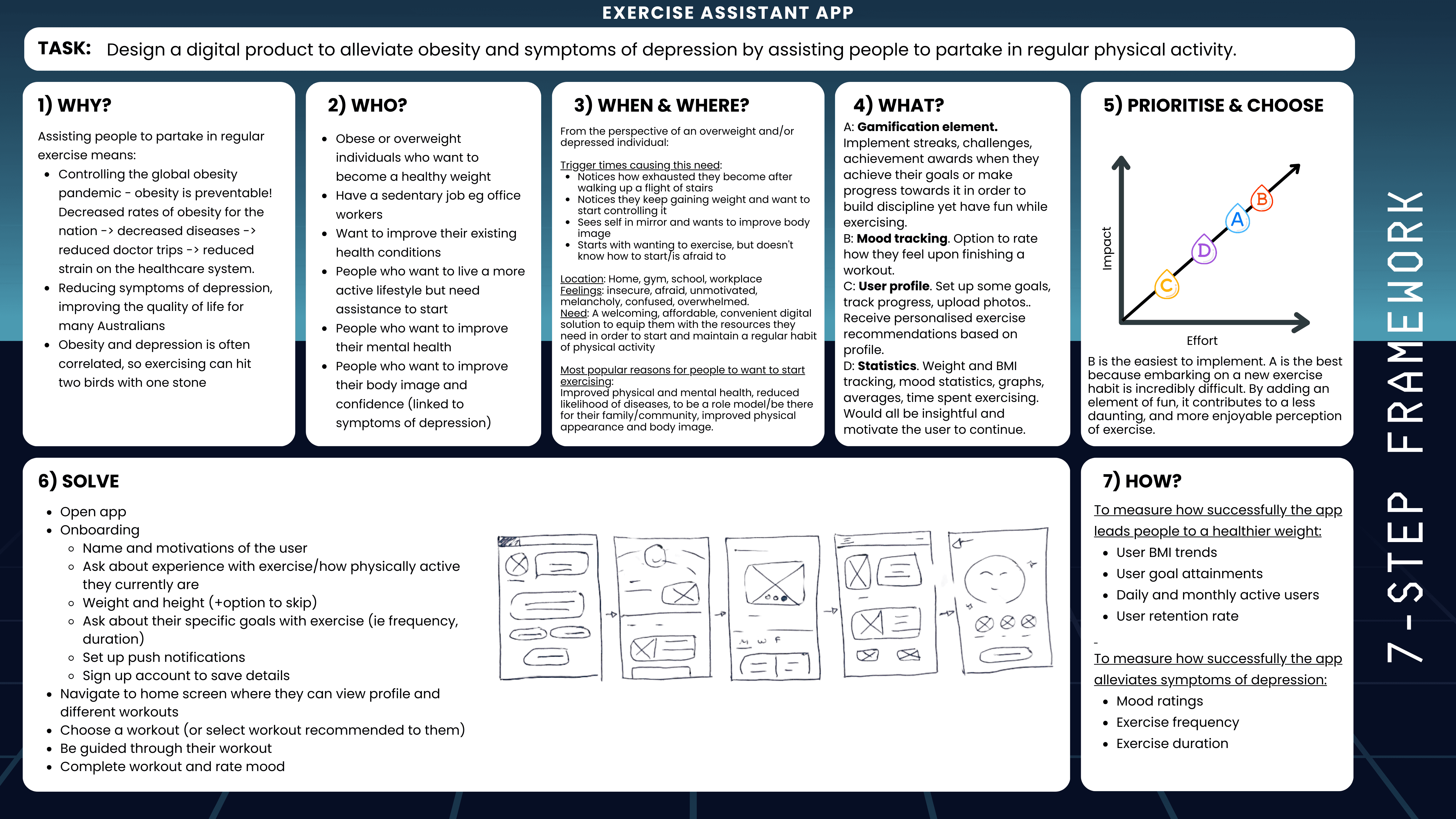
Employing Artiom Dashinsky's 7 Step Framework from Solving Product Design Exercises, I systematically addressed the design challenge by concentrating on crucial questions and elements. This guided approach encouraged a structured yet innovative ideation process, balancing thoroughness with flexibility.
Three Concept Variations
To address the aforementioned deliverables, I approached the design process by designing three initial concept variations of the same app before user research is conducted. Tackling the issue from numerous angles early on is particularly advantageous because :
a) I generate numerous ideas I would have never thought about otherwise
b) It prevents me from becoming pigeon-holed into developing a prototype for a subpar solution.
Context Variation
The first design concept caters exclusively to rural Australians facing depression, emphasising group-focused exercises. All content, features, and UI components should therefore be thoughtfully crafted to address this audience's specific questions and needs they may have.

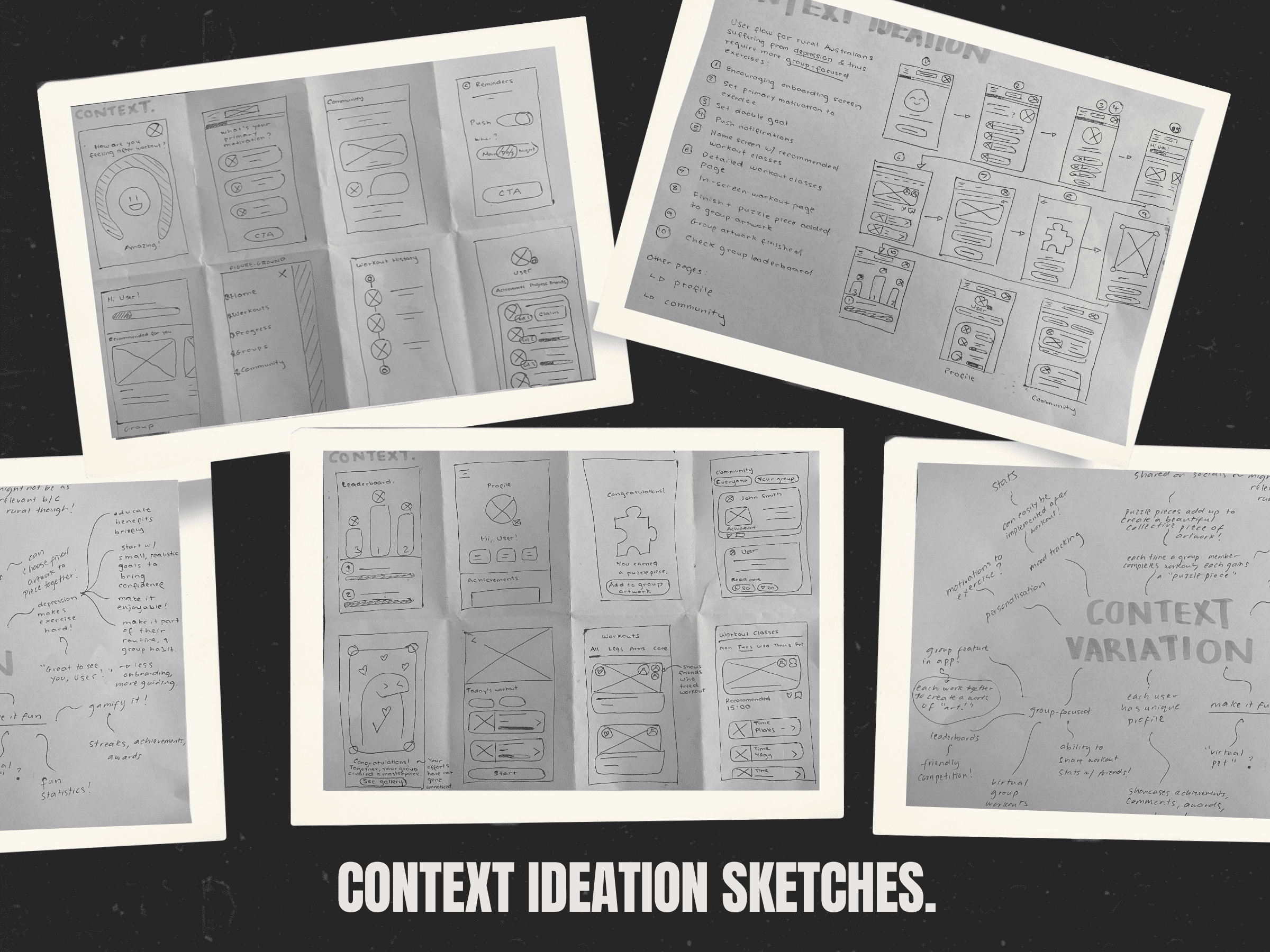
This concept aimed to make exercise enjoyable and sustainable, particularly for those with depression, for whom even daily tasks can be challenging. By incorporating features like leaderboards and achievements, I wanted to create a sense of anticipation and motivation, making exercise something to look forward to.
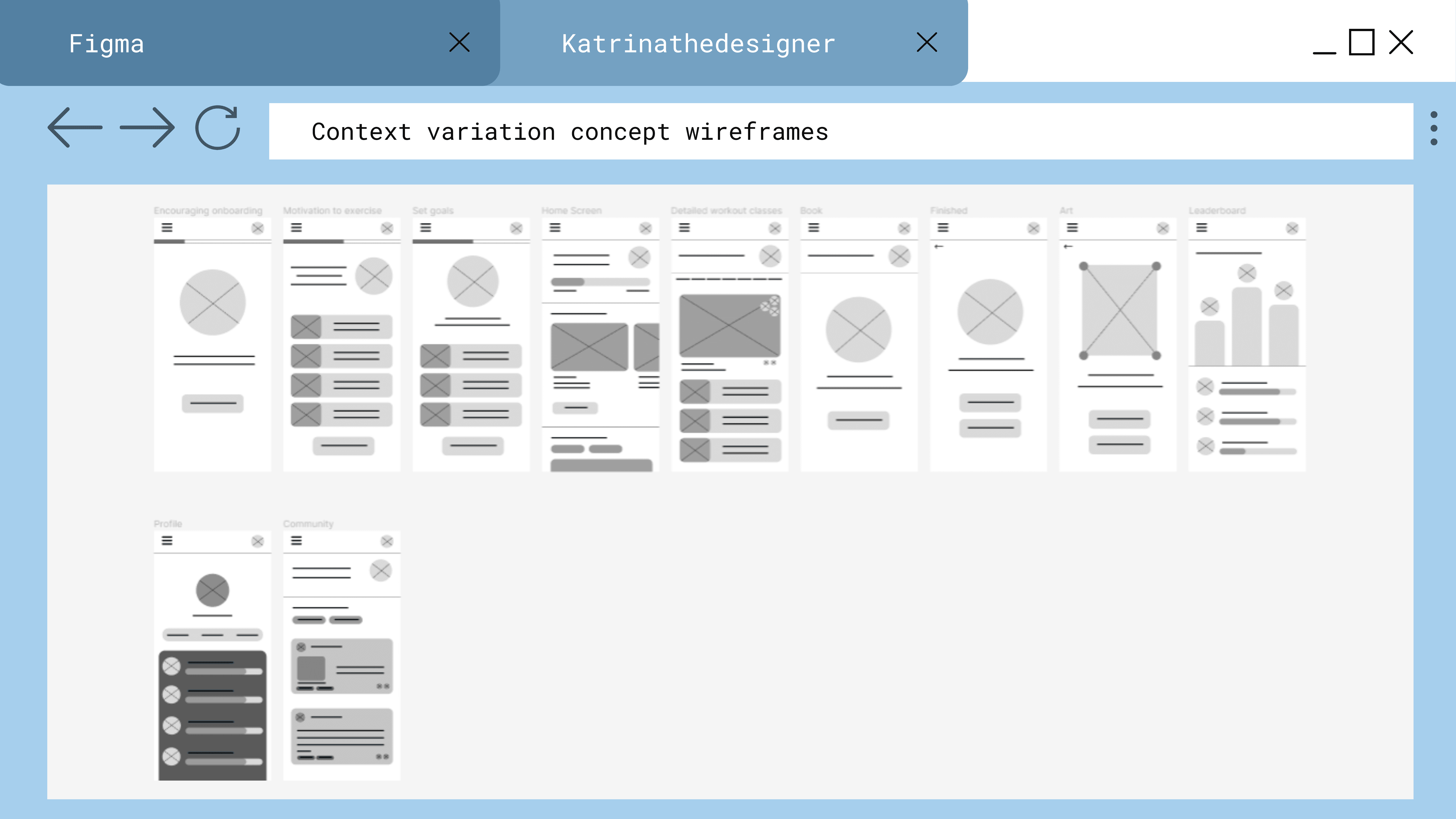
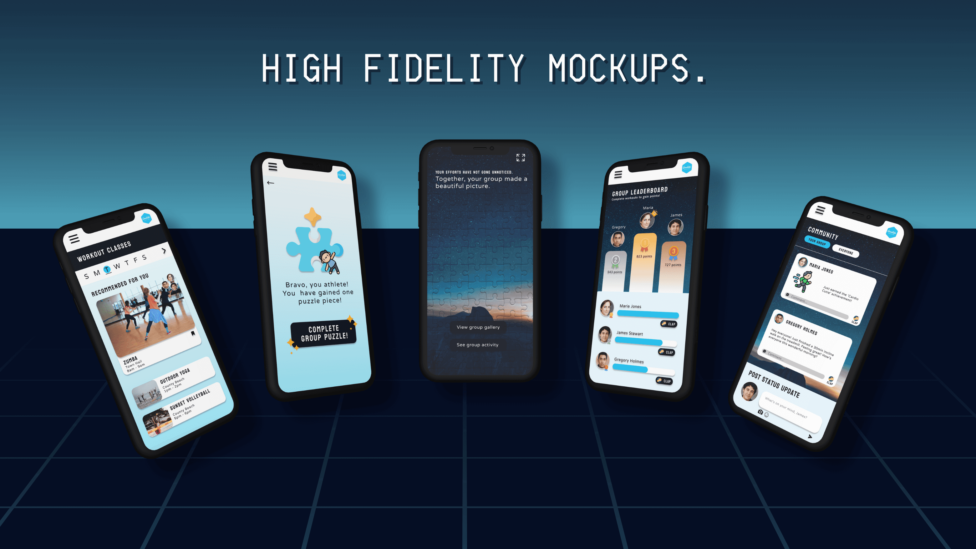
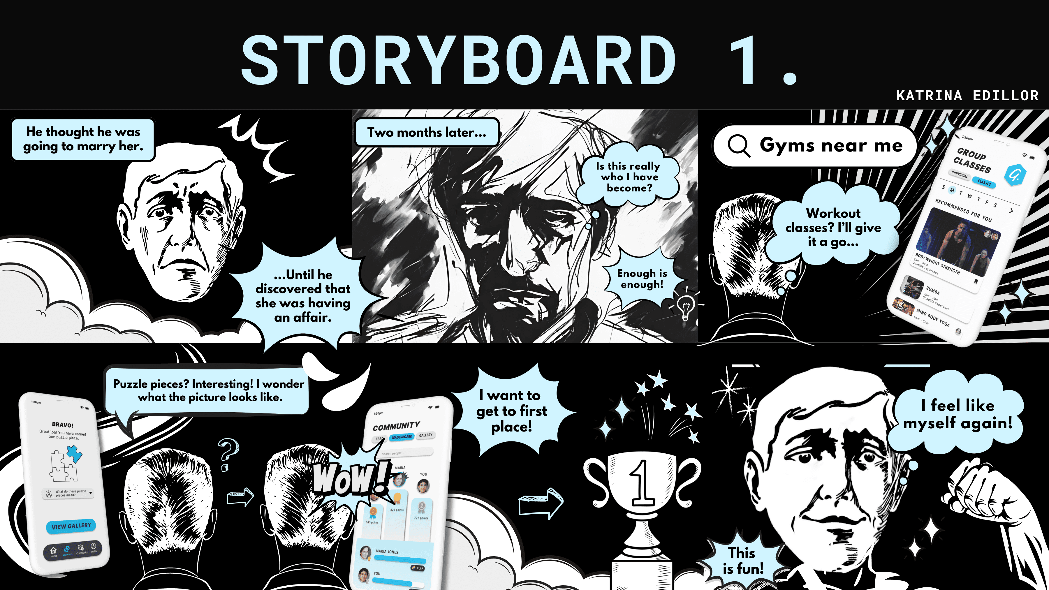
Each time a group member completes a workout, they earn a 'puzzle piece.' As these pieces come together, they create a beautiful, collective image, symbolising the team's journey. This visual celebration fosters camaraderie and serves as a heartfelt tribute to their dedication and hard work.
Aesthetic Variation
I was tasked to design a concept for the app based entirely on Firefox’s ‘Acorn’ design language, which involves bold, vibrant colours and playful illustrations. In this concept, I was given the liberty to break away from Goodlife Health Clubs' current design language and branding, allowing for a more imaginative and innovative approach to the interface design.
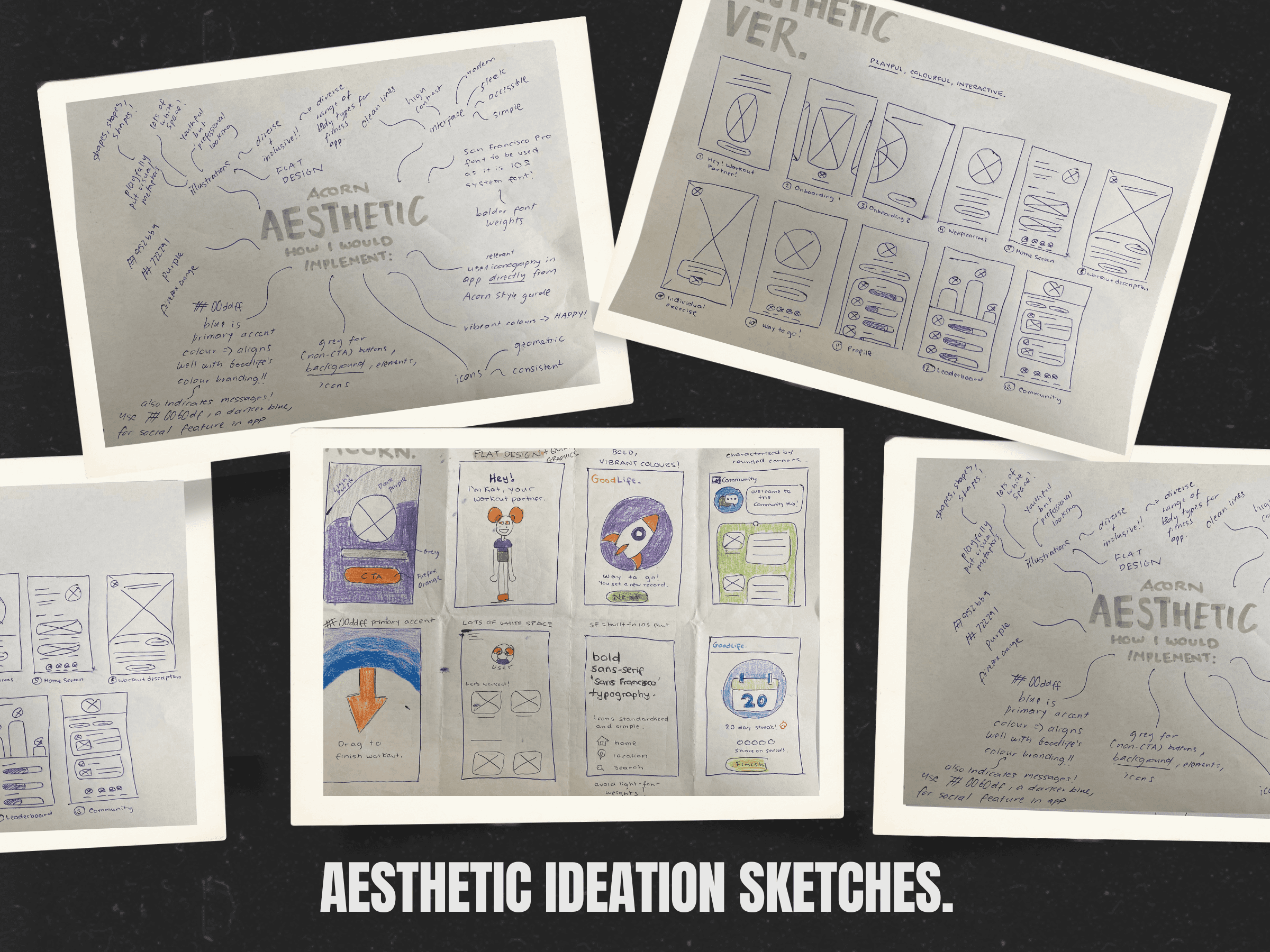
Harnessing the joy and energy of childhood play, this concept reimagines exercise for adults as a fun and lighthearted experience. By infusing workouts with a sense of playfulness, the design encourages users to embrace exercise not as a daunting task, but as an enjoyable and rewarding activity.
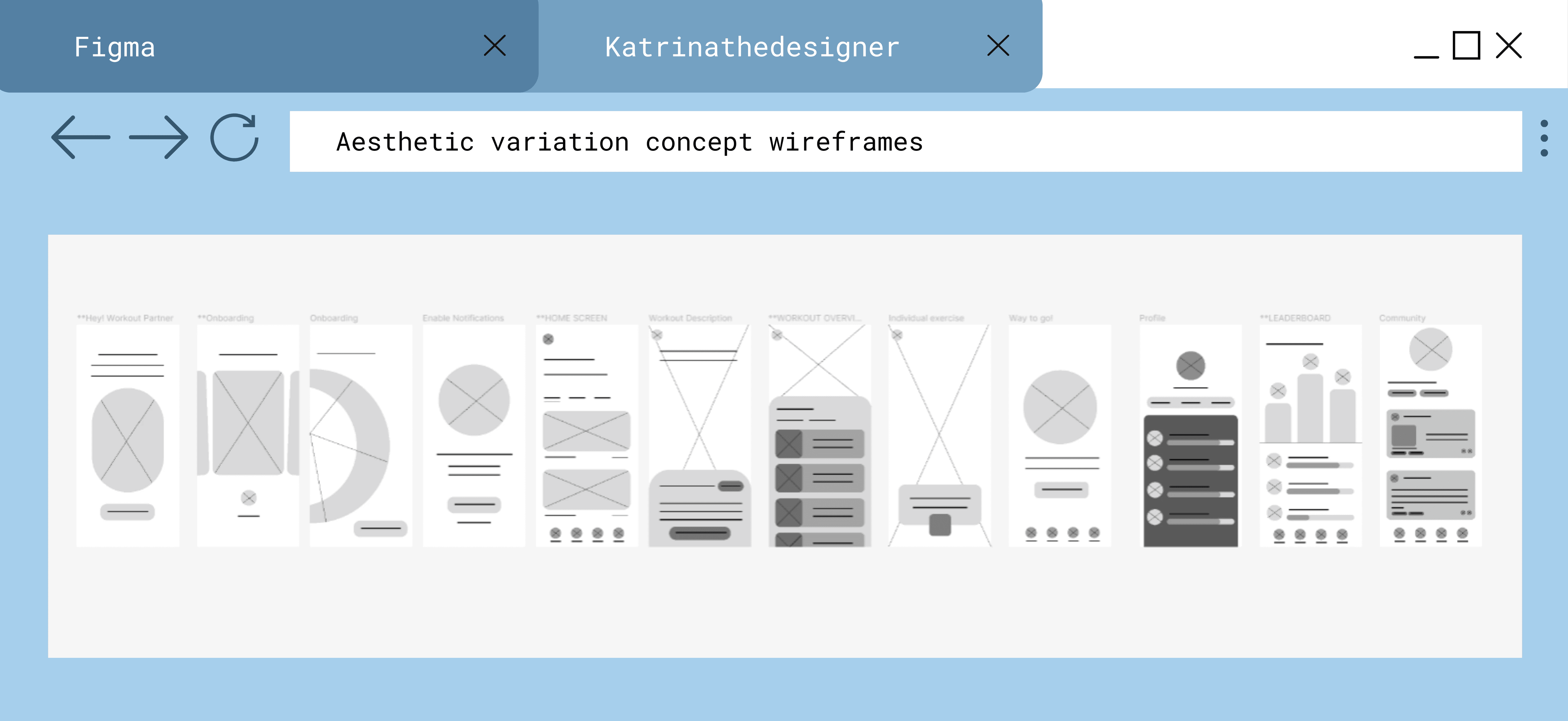
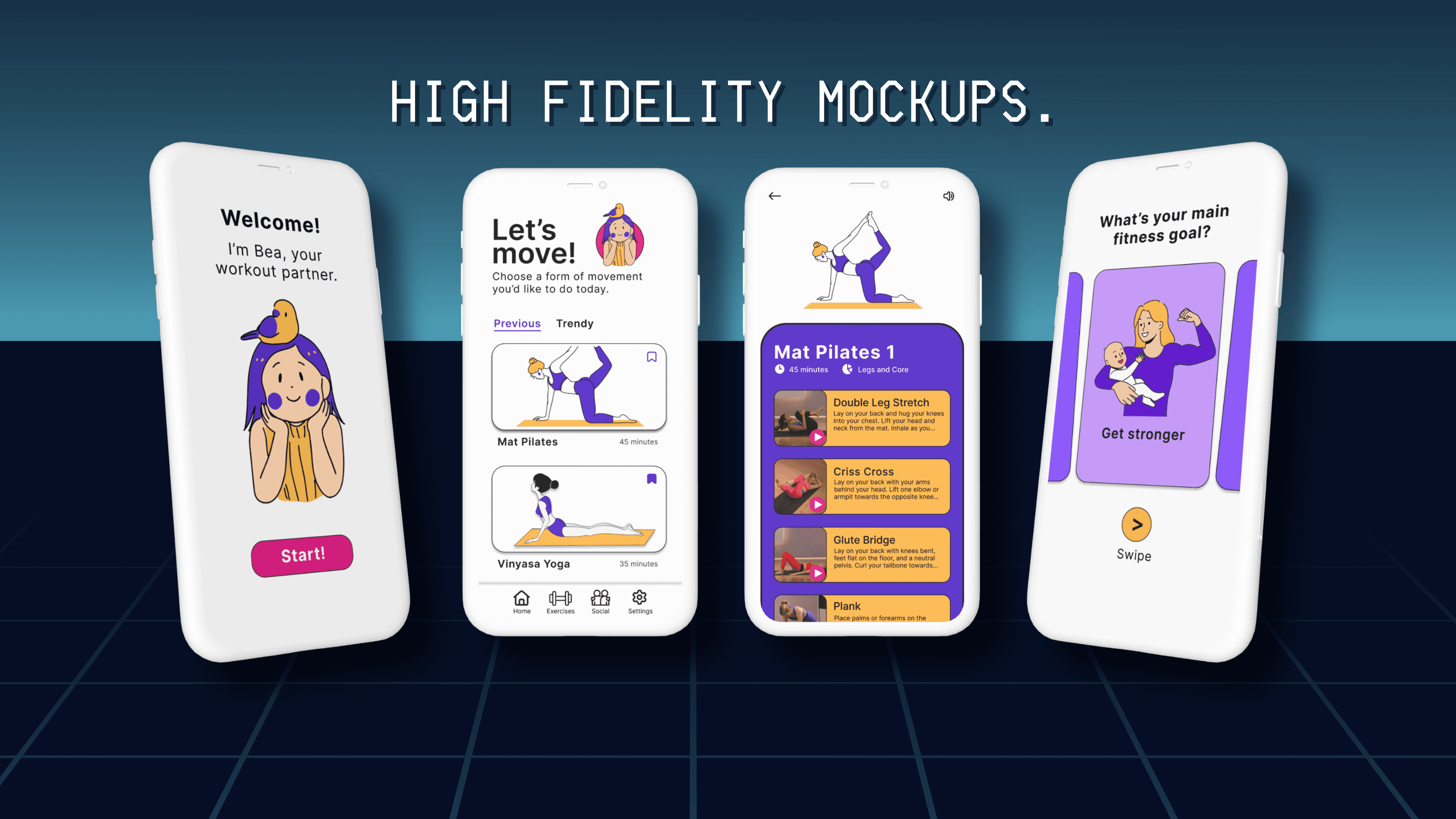
This concept allowed me to approach the problem from a more playful angle, using vibrant colors and incorporating a workout buddy feature to make exercise fun and engaging. Exercise doesn’t have to be serious and methodical for it to "count". I aimed to make it accessible and welcoming, avoiding the intimidating atmosphere of other fitness apps.
Accessibility Variation
This concept focuses solely on users with low vision, emphasising high-contrast interface design, large fonts, and prominent iconography to enhance accessibility.
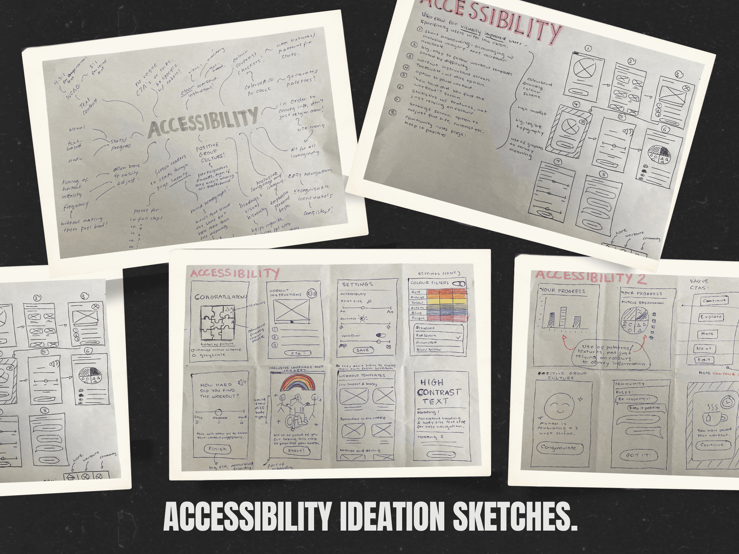
I conducted research to enhance app accessibility for the visually impaired, addressing challenges with screen readers and assistive technologies. I sketched screens featuring audio options and robust accessibility settings. Beyond the initial scope, I designed screens to foster inclusivity, including cheering interfaces and graphics featuring diverse representations, such as individuals in wheelchairs.
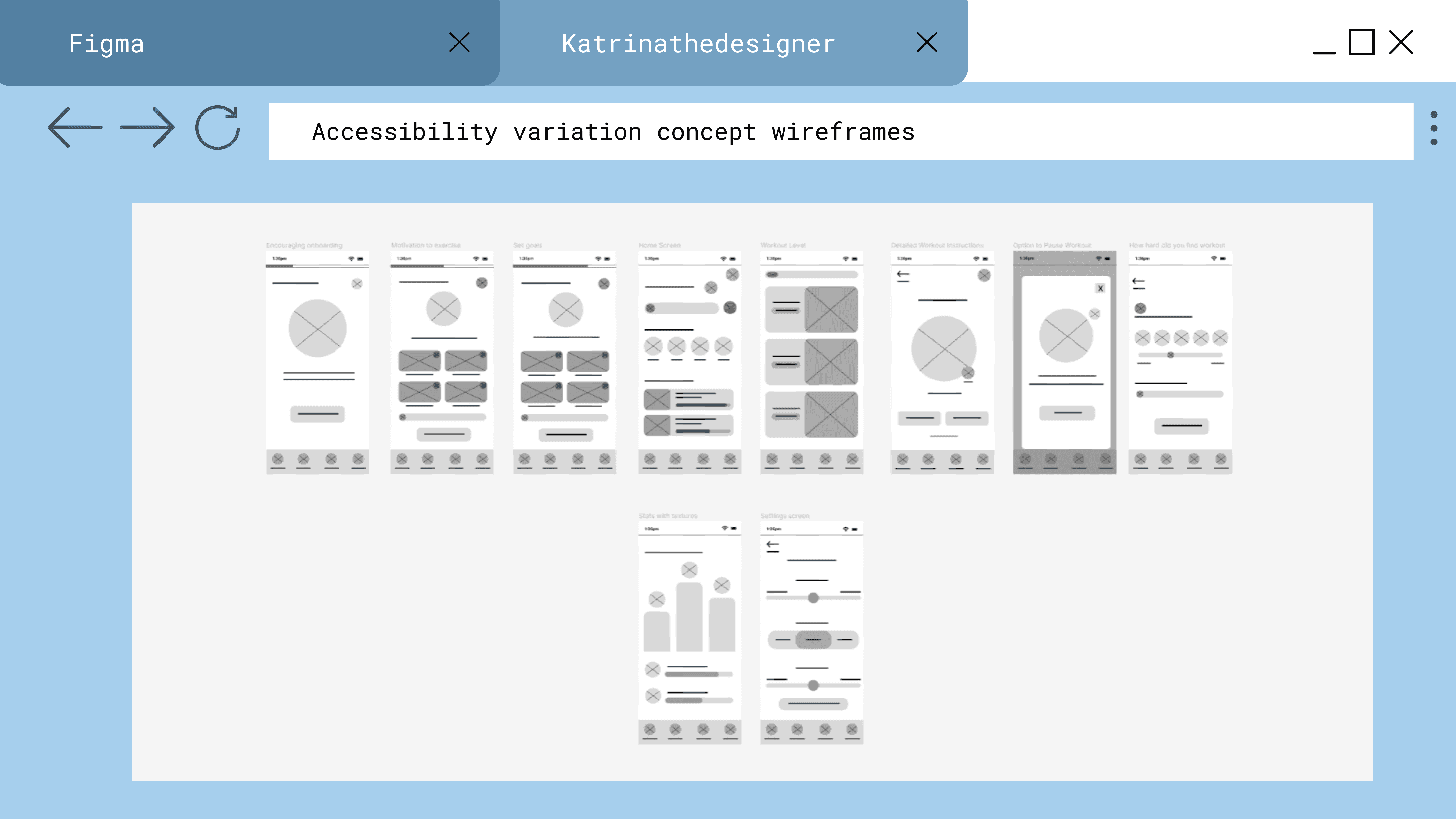
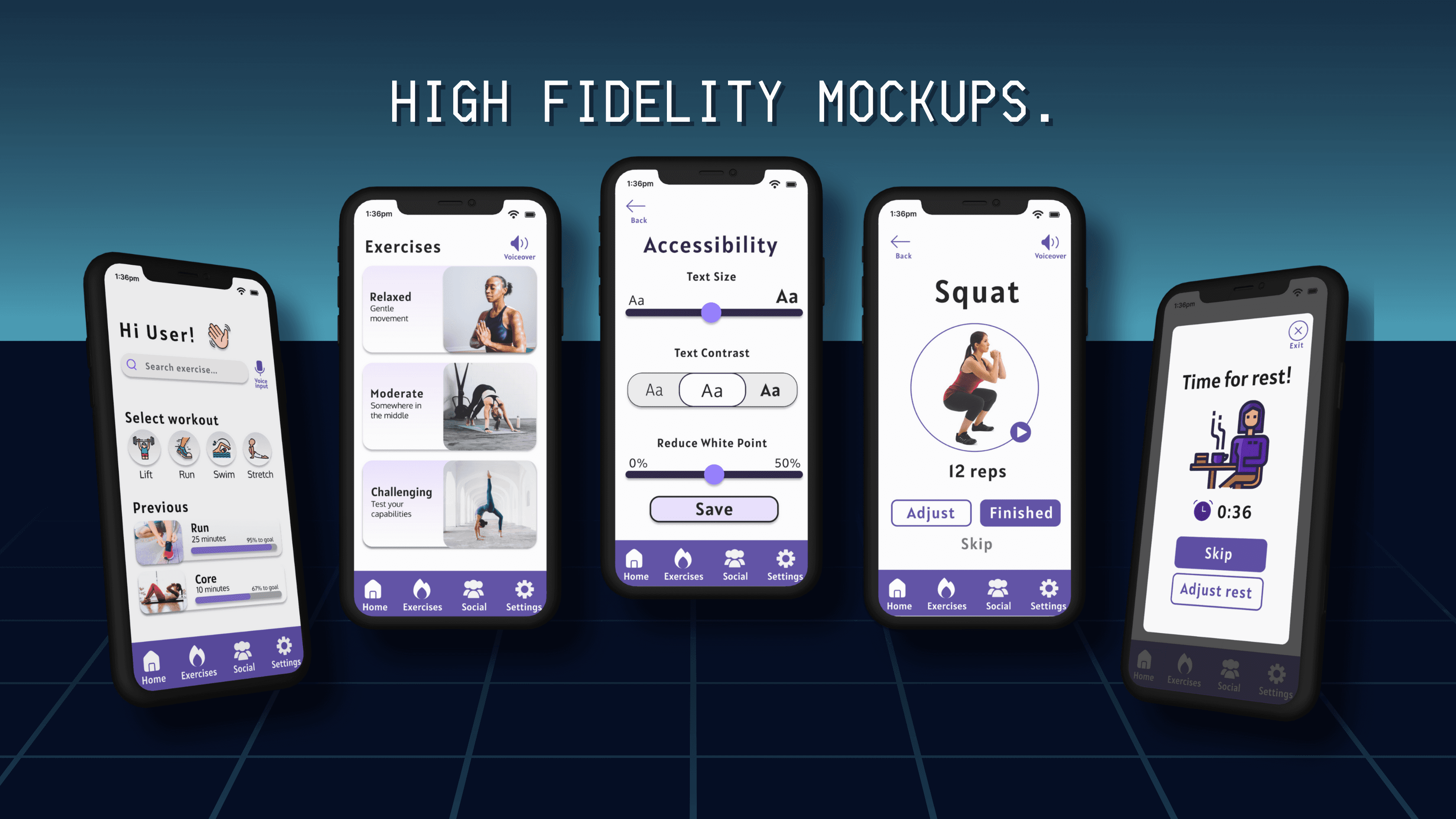
Emphasising large iconography, text, and unambiguous meaning, this concept sought to simplify exercise for users. Adhering to the Web Accessibility Guidelines, I carefully selected a color scheme with ample contrast, guaranteeing optimal visual clarity and ease of use.
Client Research
I gathered pertinent background information about GoodLife Health Clubs to better understand their branding, message, and goals. By emphasising an authentic connection with clients and celebrating the various reasons people choose fitness, Goodlife aims to create a welcoming environment that promotes overall well-being.
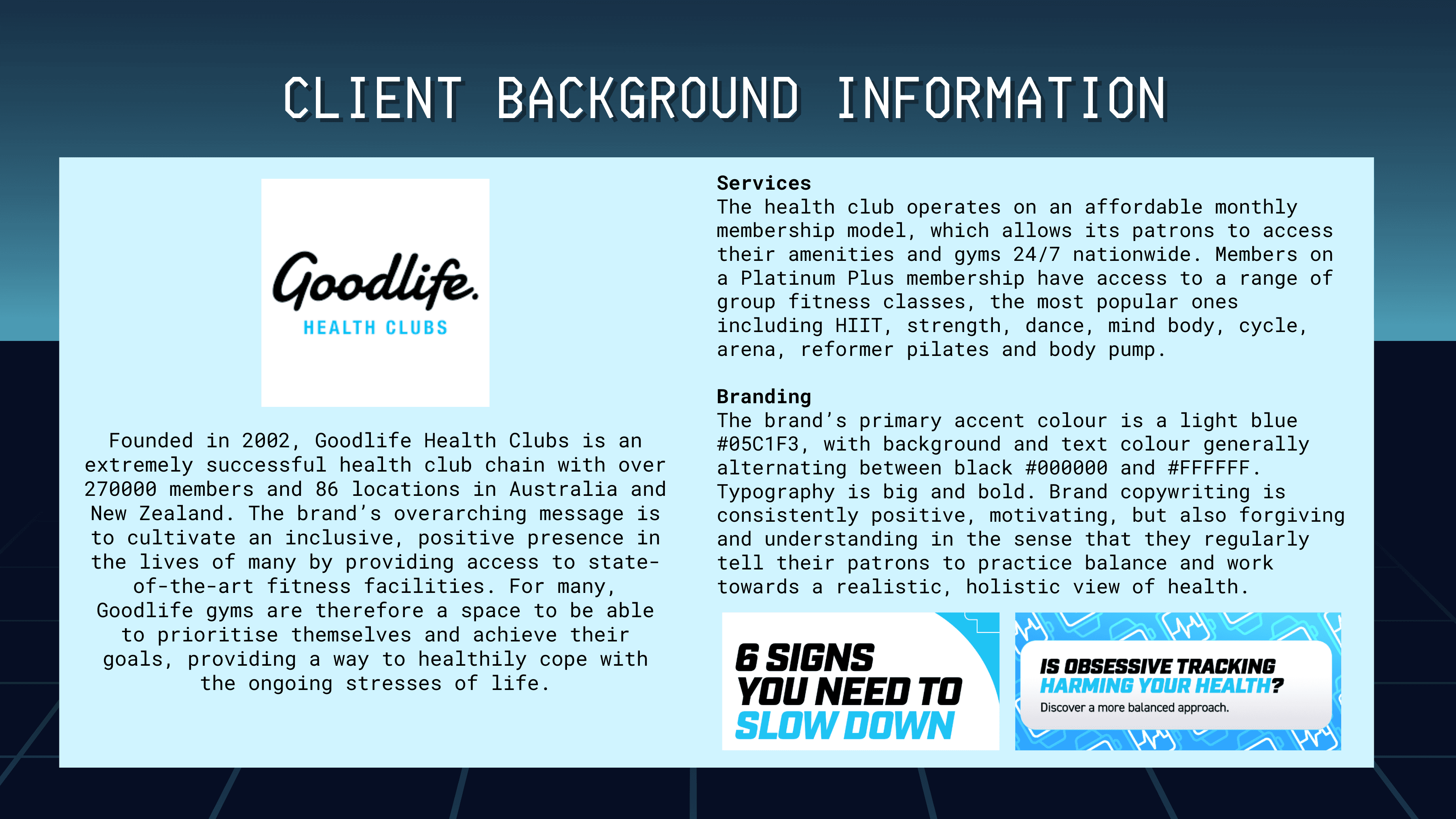
Competitive Audits
Examining direct competitors and similar apps, I analysed successful design elements and common UX principles. By distilling the most effective aspects of these competitors and identifying areas for improvement, I am more able to effectively create a design solution that not only matches but surpasses current industry standards.
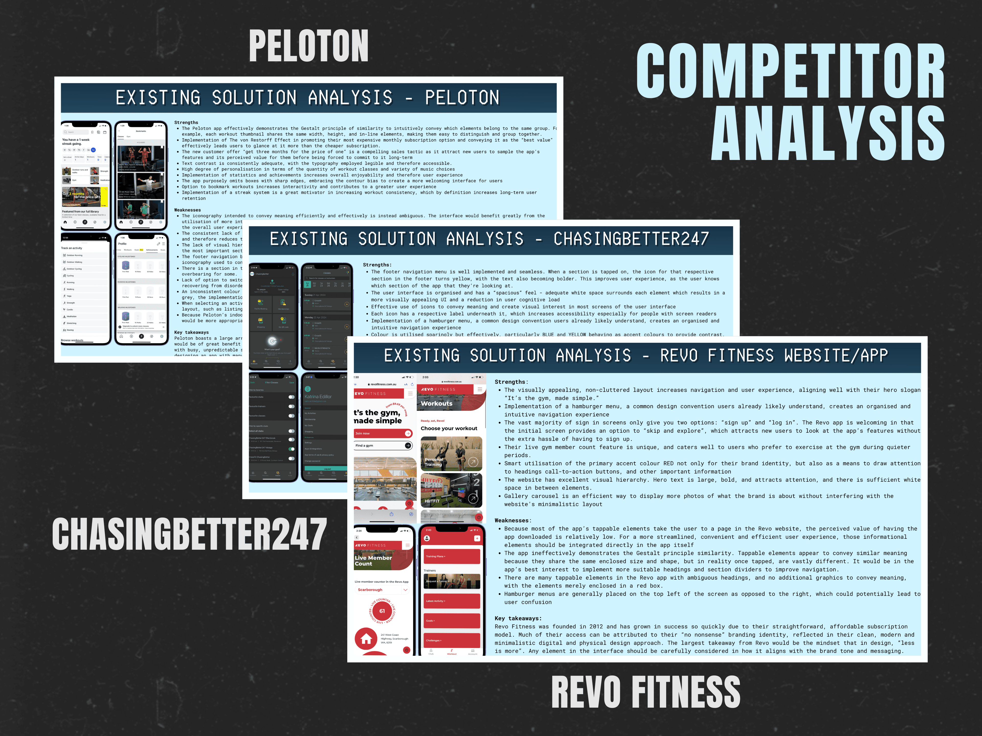
Current Trend Research
To stay ahead of the curve, I identified current or emerging UX or interactive App design trends that I could weave into the design.
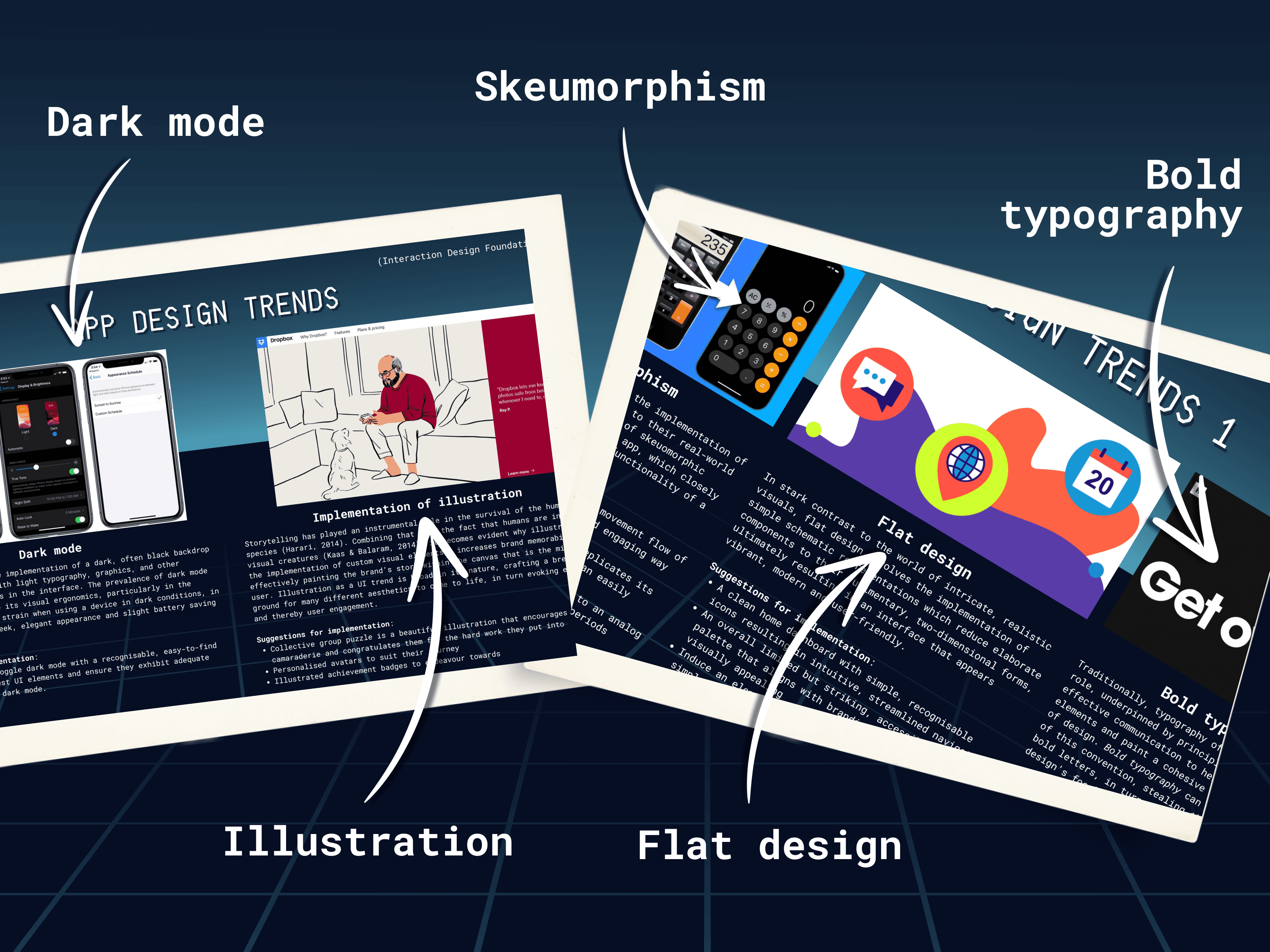
User Interviews
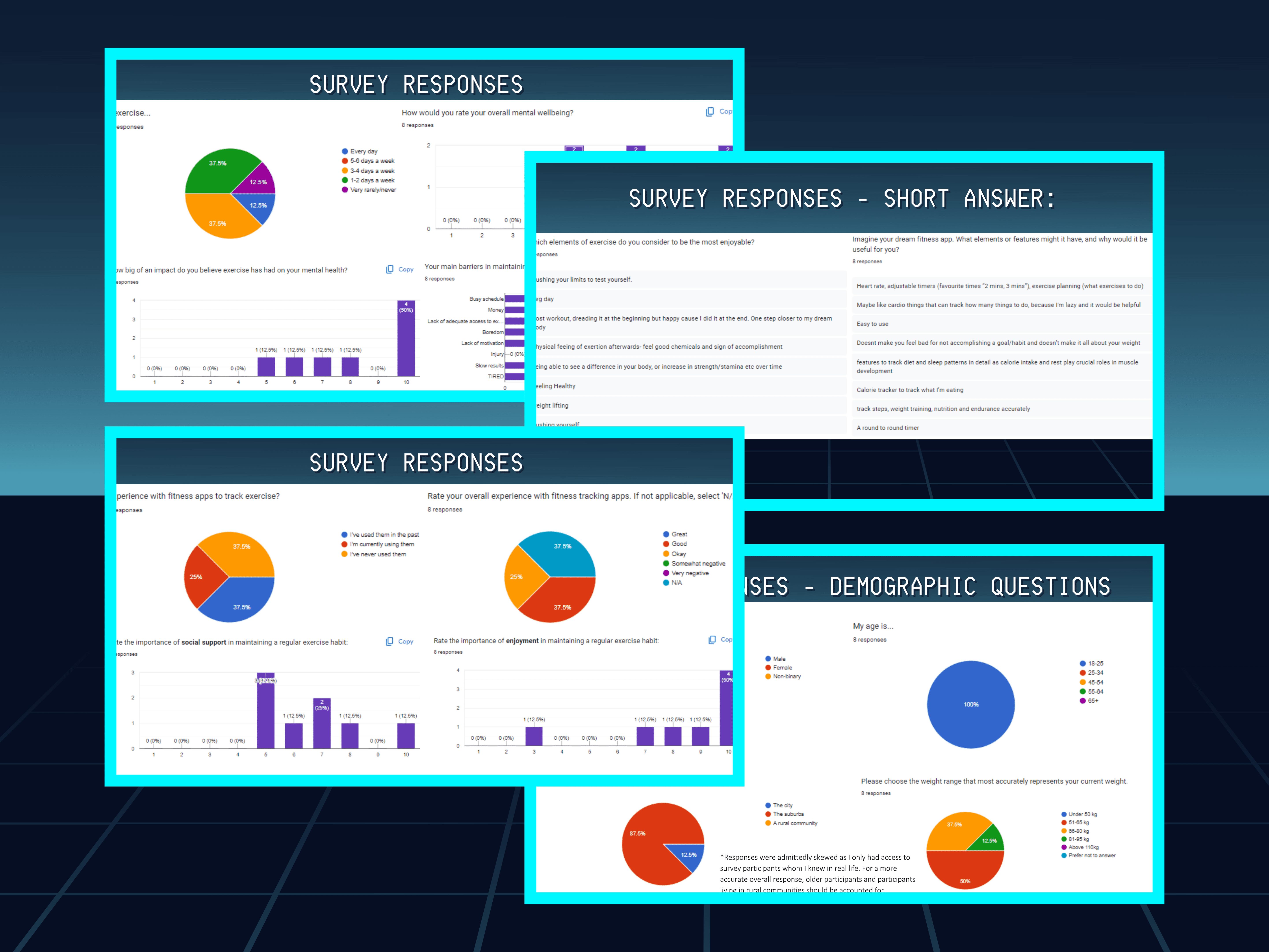
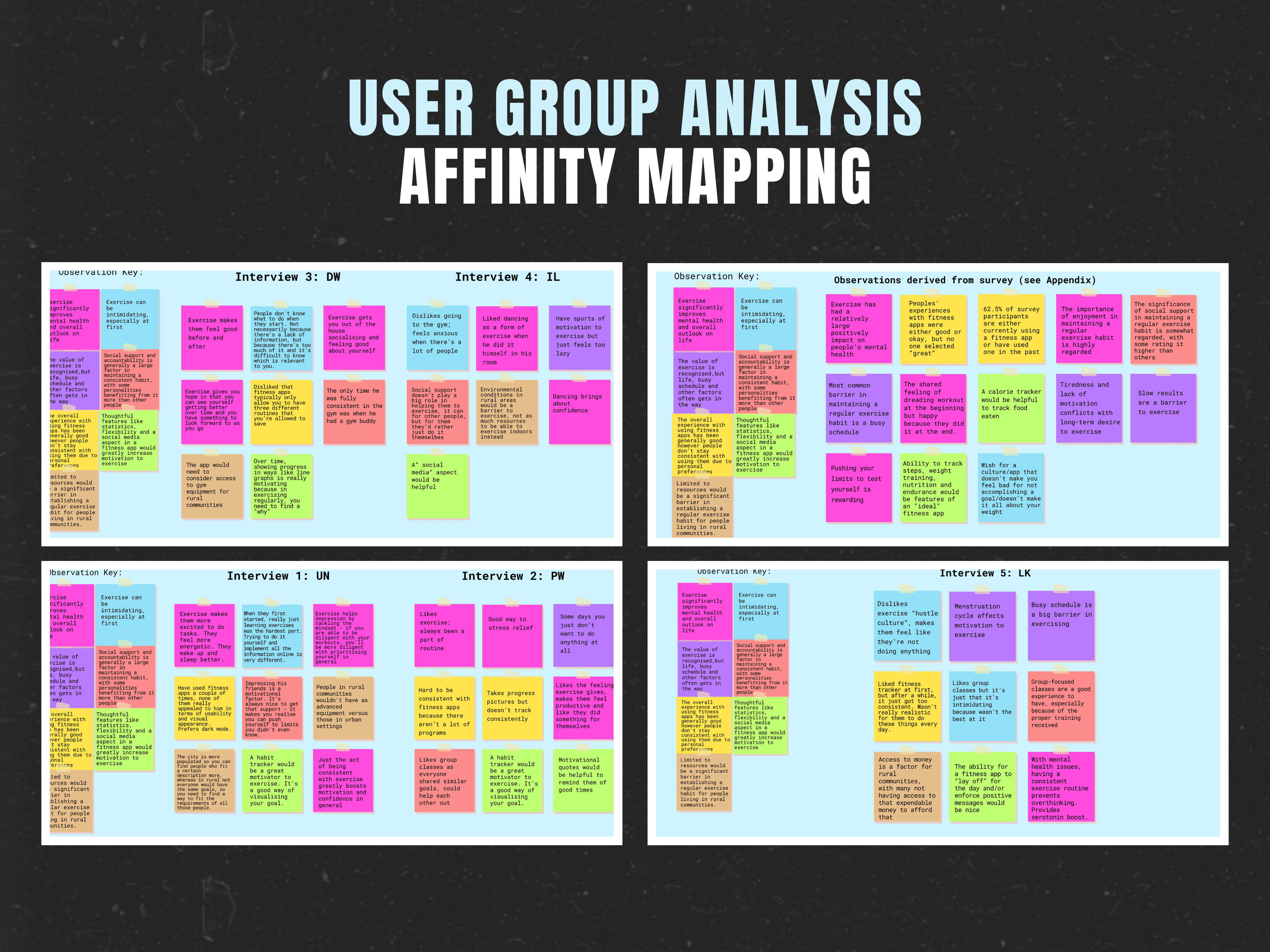
Interviewing and surveying five users about their exercise habits and fitness app experiences, I identified seven common themes in their responses and organised these insights using affinity mapping techniques.
User Goals
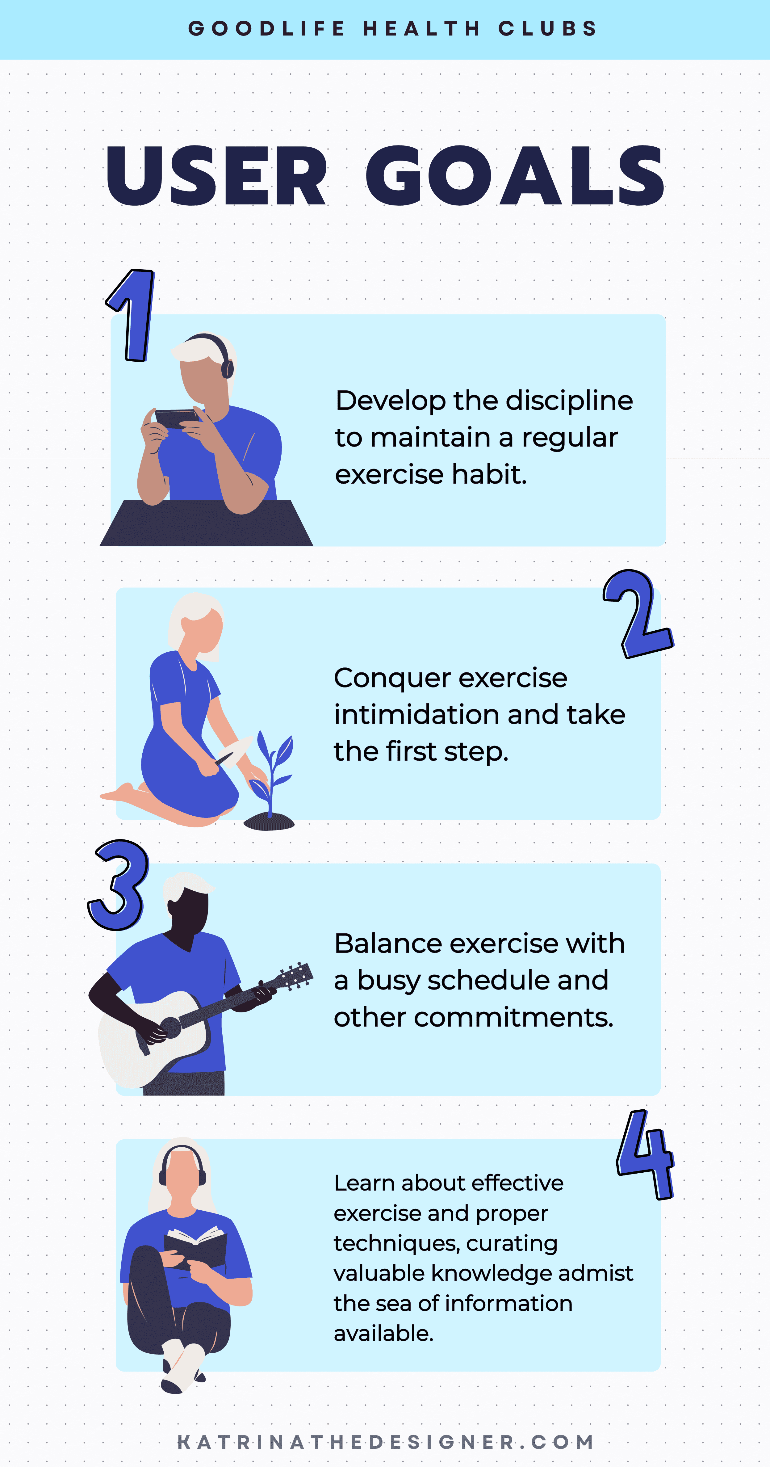
Analysing user interview data, I identified four primary fitness goals shared among the participants.
Personas and Scenarios
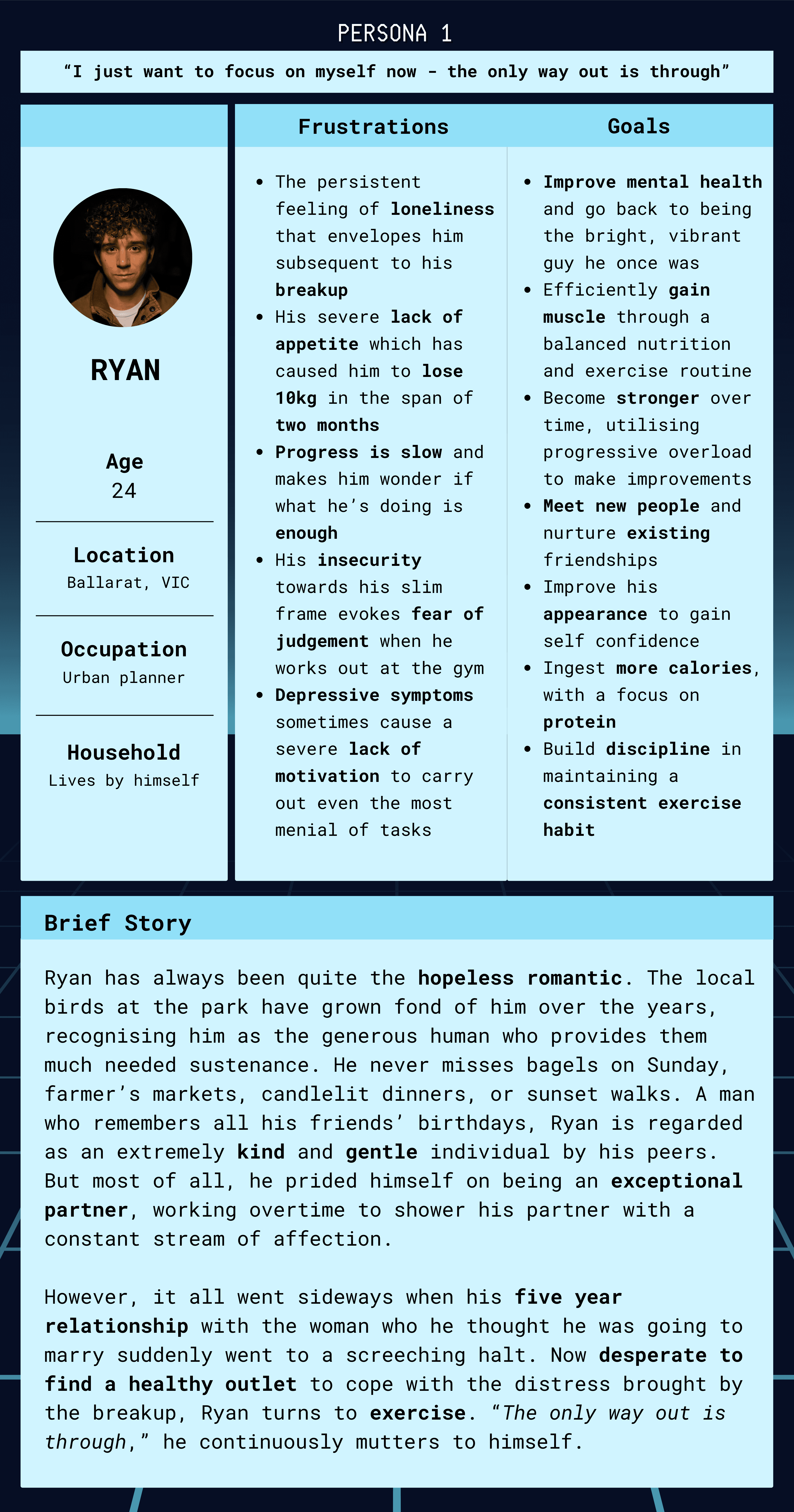
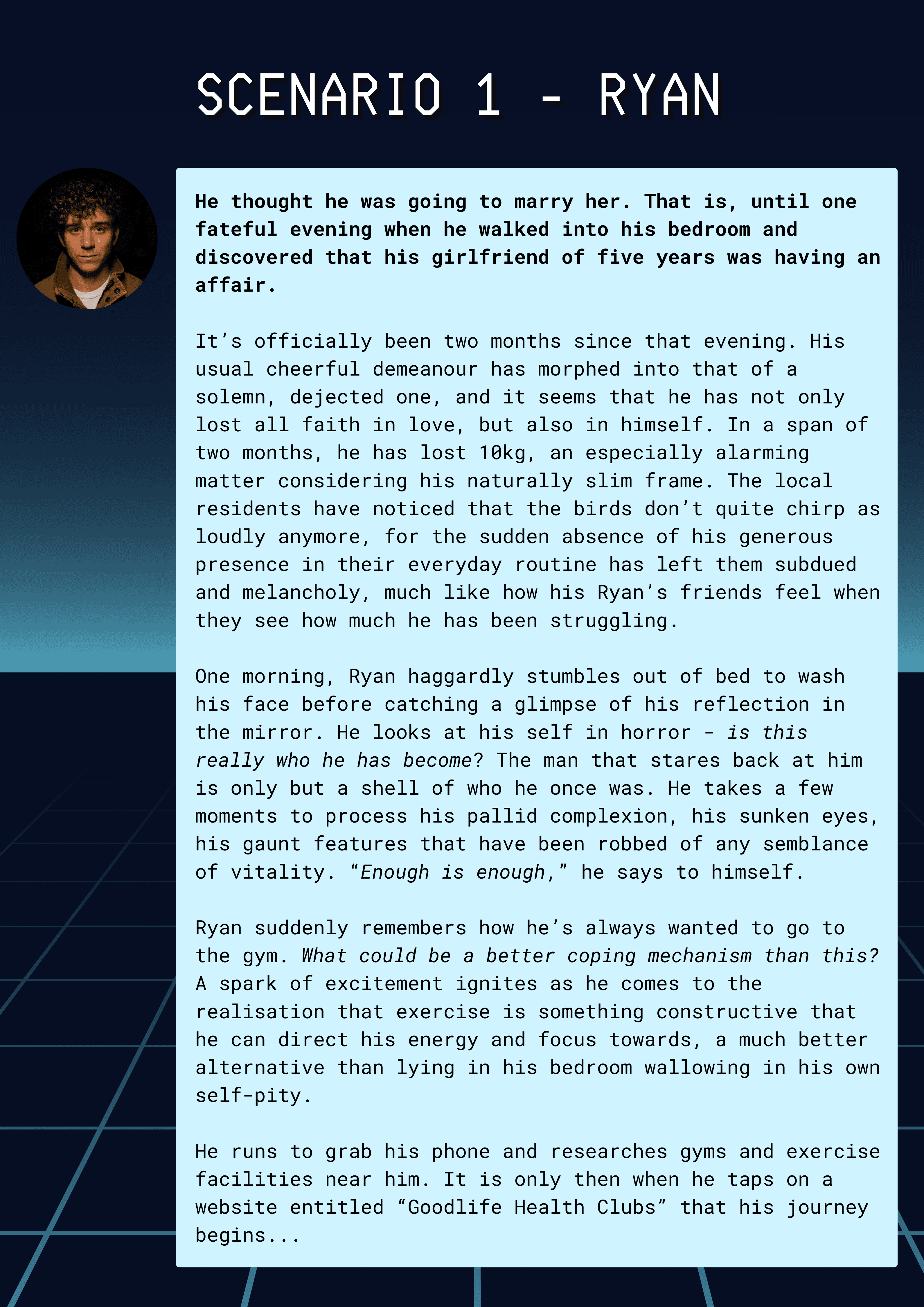
I then went on to devise four different personas, with distinct goals and frustrations reflective of the target user as informed by my research. From these personas, I composed three scenarios, visualised by storyboards that helped establish a clear vision and focus for the Goodlife project.


The Final Prototype
Feedback revealed that the aesthetic variation was the most aesthetically pleasing, while the context variation had more innovative features.
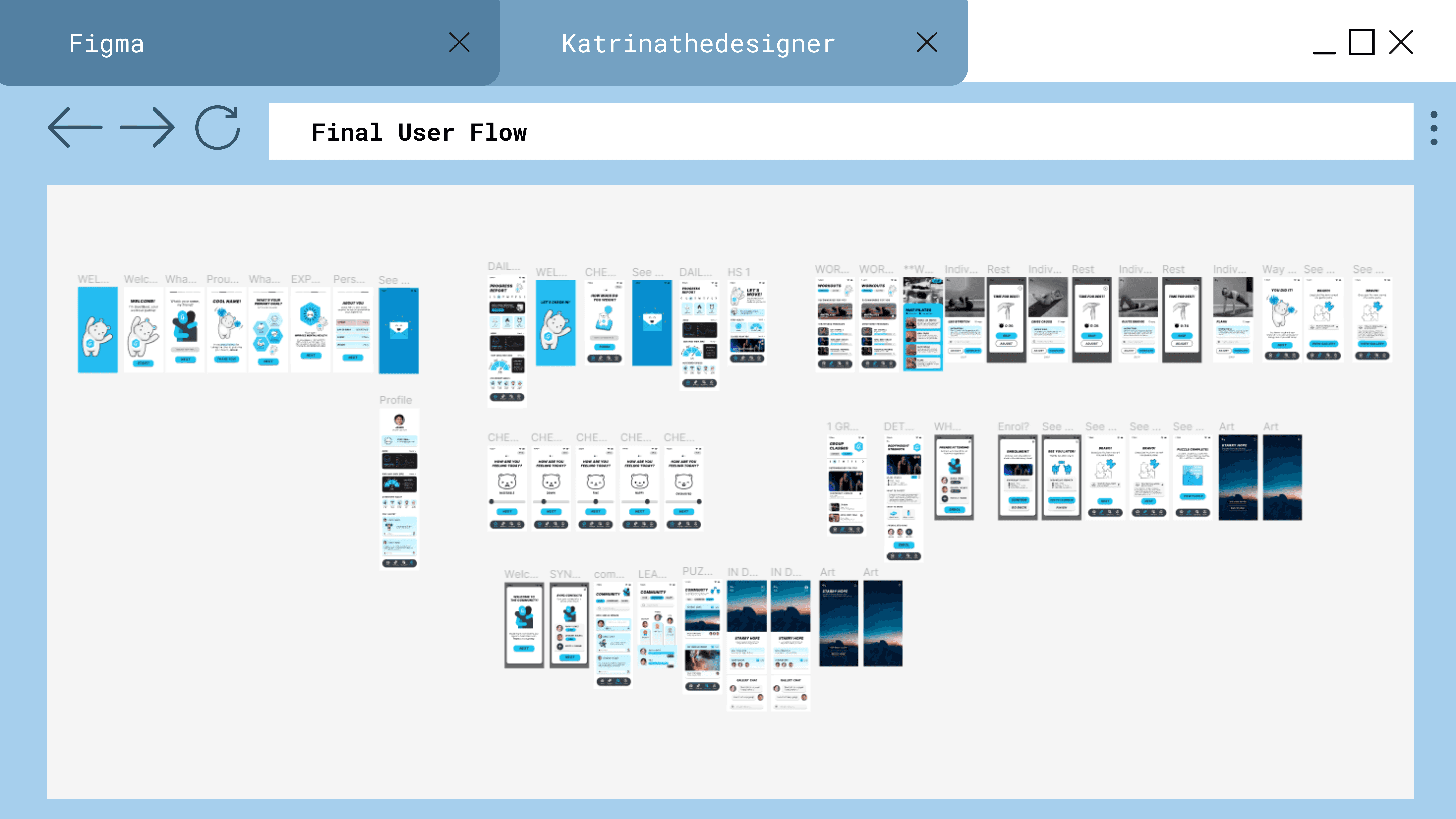
Inspired by this, I designed the final prototype, harmonising the aesthetic variation's uplifting visuals with Goodlife's design language and thoughtfully integrating the context variation's engaging elements like leaderboards, community, and celebratory puzzles. This blend nurtures a sense of connection and joy, enhancing the user experience.
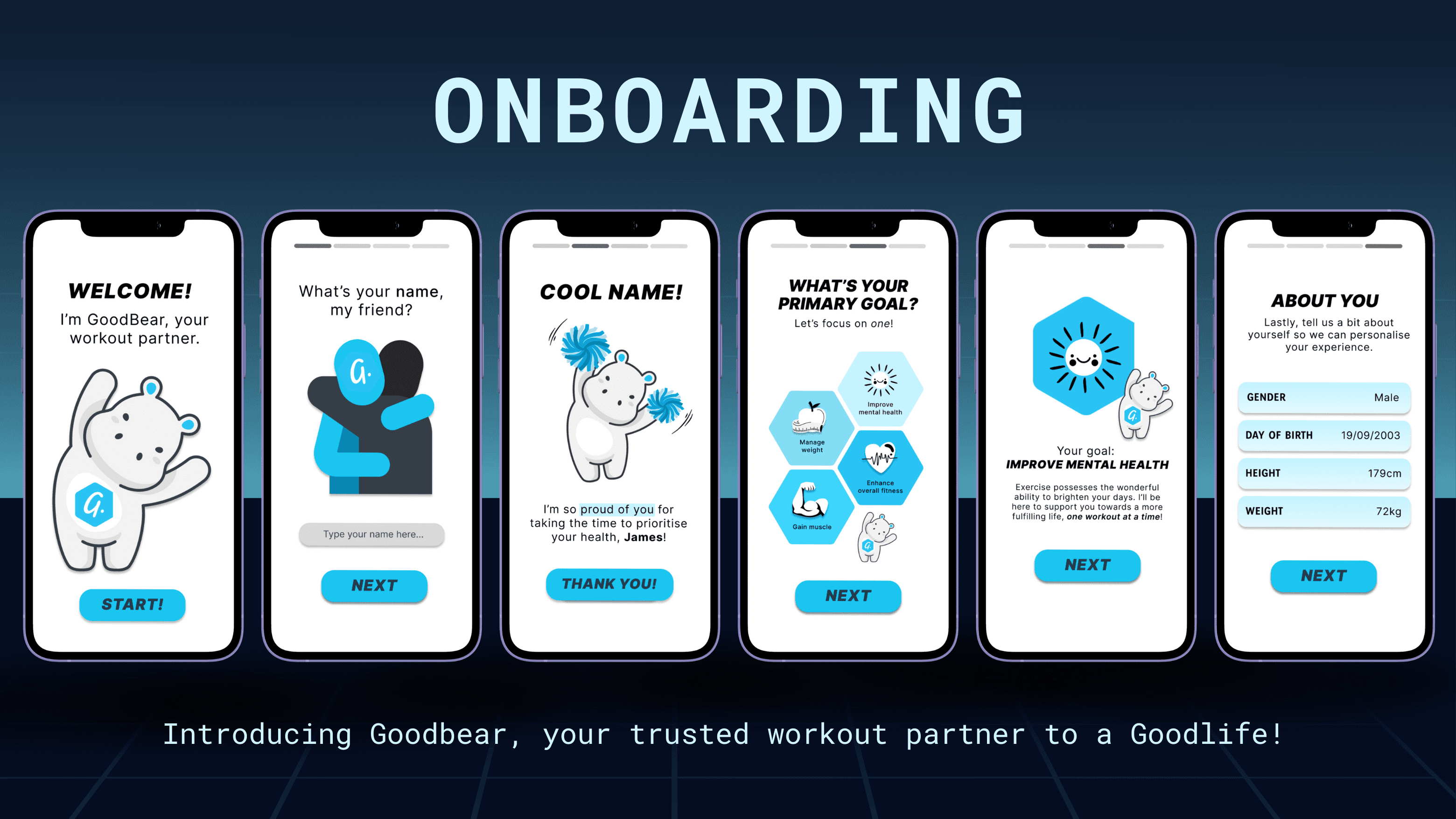
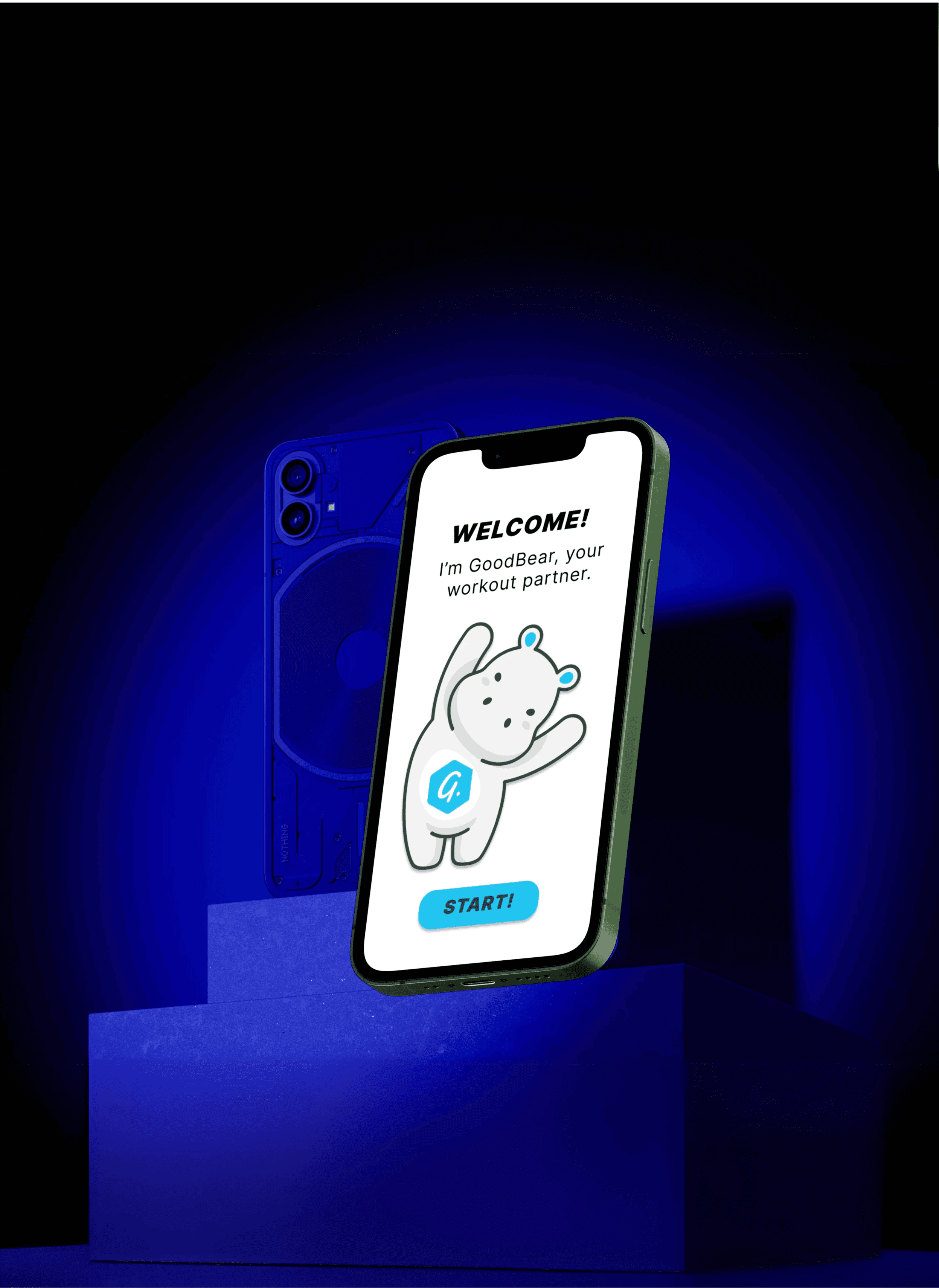
Introducing Goodbear, your trusted workout partner to a goodlife!
You can’t spell UX Design without ‘User’!
While it may appear that I’ve finished designing the prototype, all was not complete — it was time to embark on my second round of user interviews.
Following prototype development, I conducted five more user interviews, conducting a qualitative A/B split test for selected screens. It’s important to note that while quantitative tests weren’t feasible given the parameters of the project, implementing them would have greatly improved the user testing process.
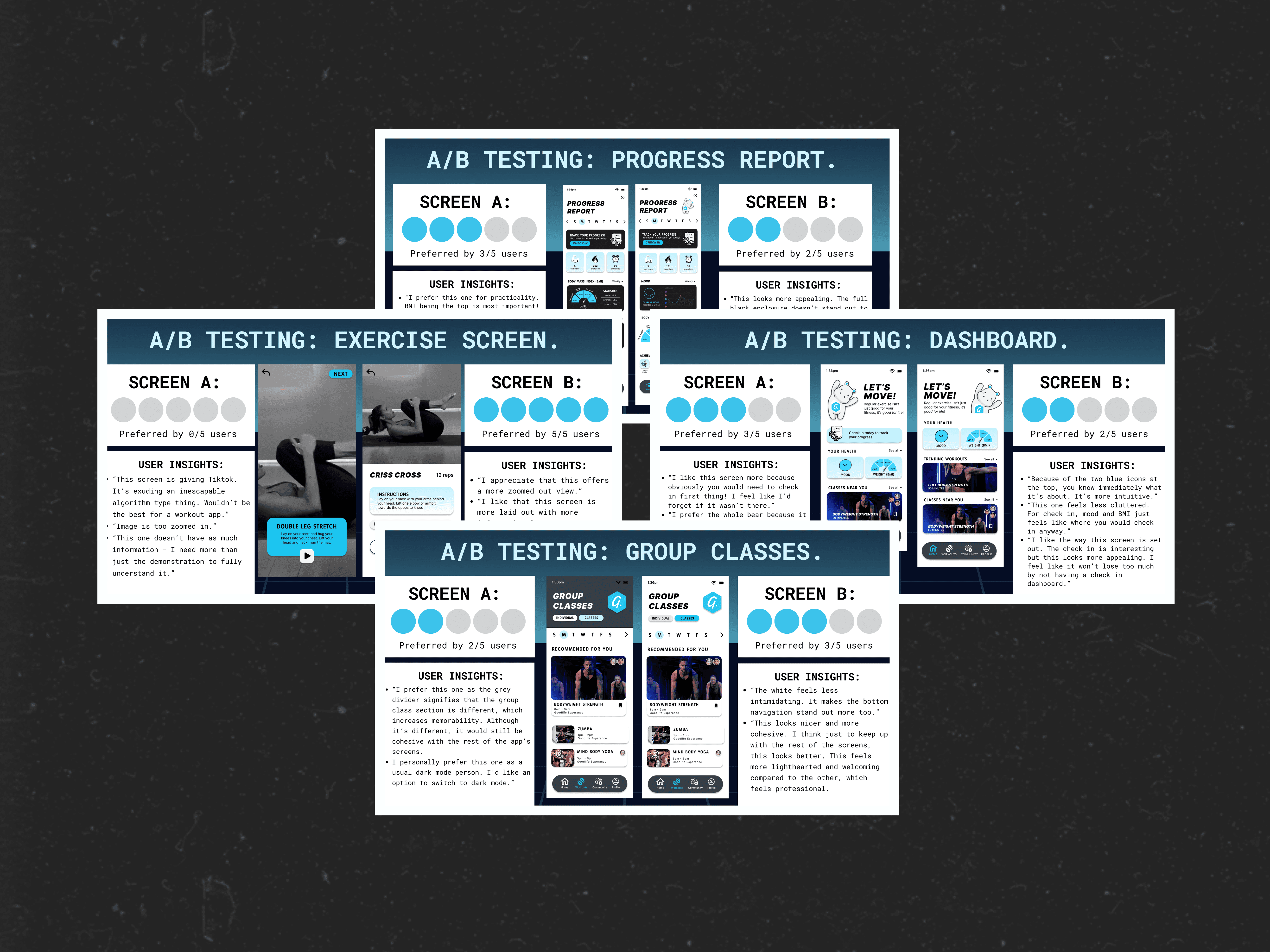
User feedback revealed various recurring themes:
Resounding consensus that the app's charming, light-hearted design cultivates an inviting, inclusive atmosphere, motivating users to focus on their health. People love the Goodbear mascot!
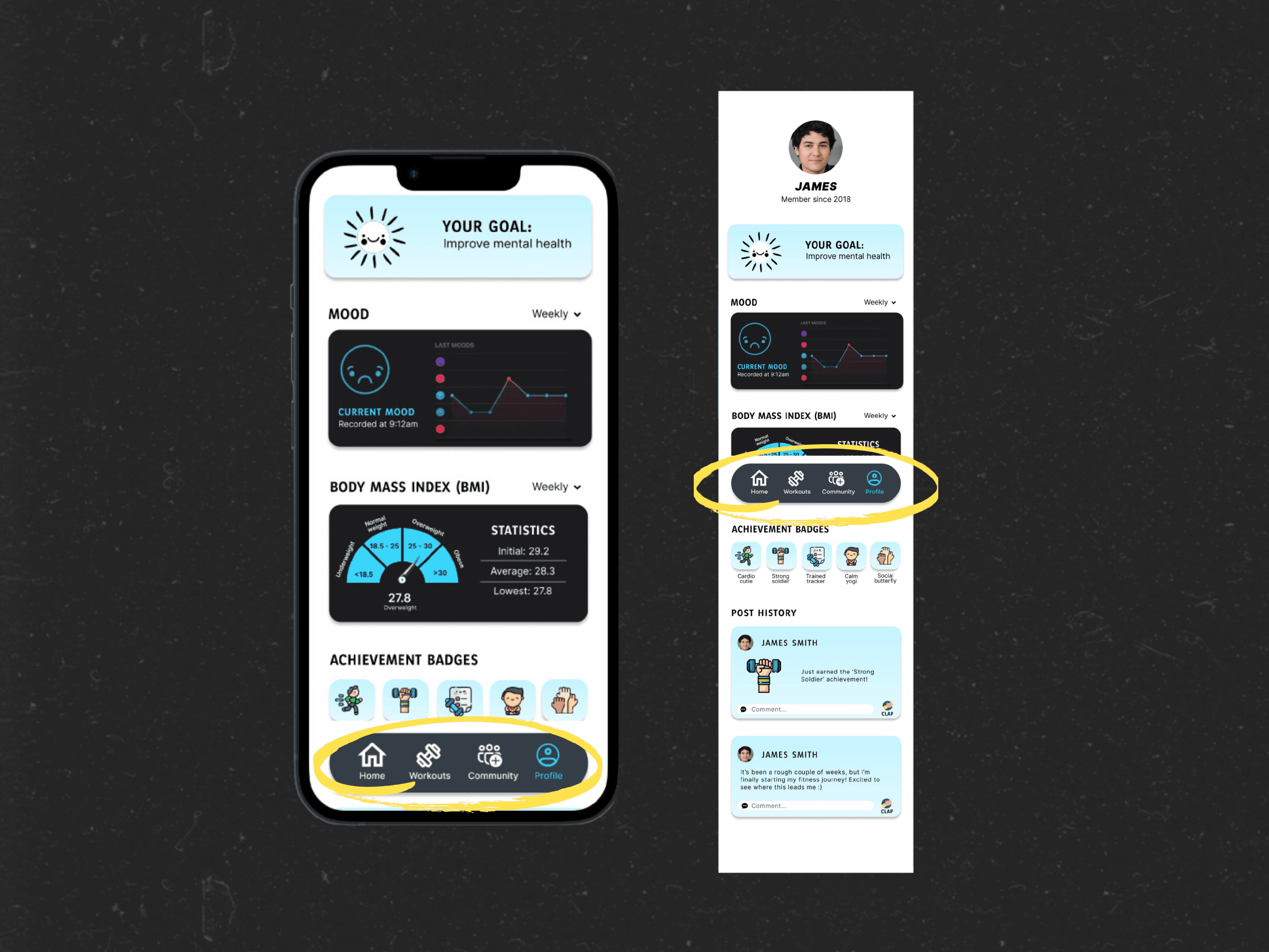
Main frustration that users encounter is the footer navigation, which made for an inconsistent navigation experience.
More interactivity in regards to the input components should be established to more closely replicate the final product.
Resulting Changes
Based on the user feedback received, some of the key changes made were:
Changed the scroll behaviour of the footer navigation from "scroll with parent" to "fixed", ensuring it always stayed in view while scrolling
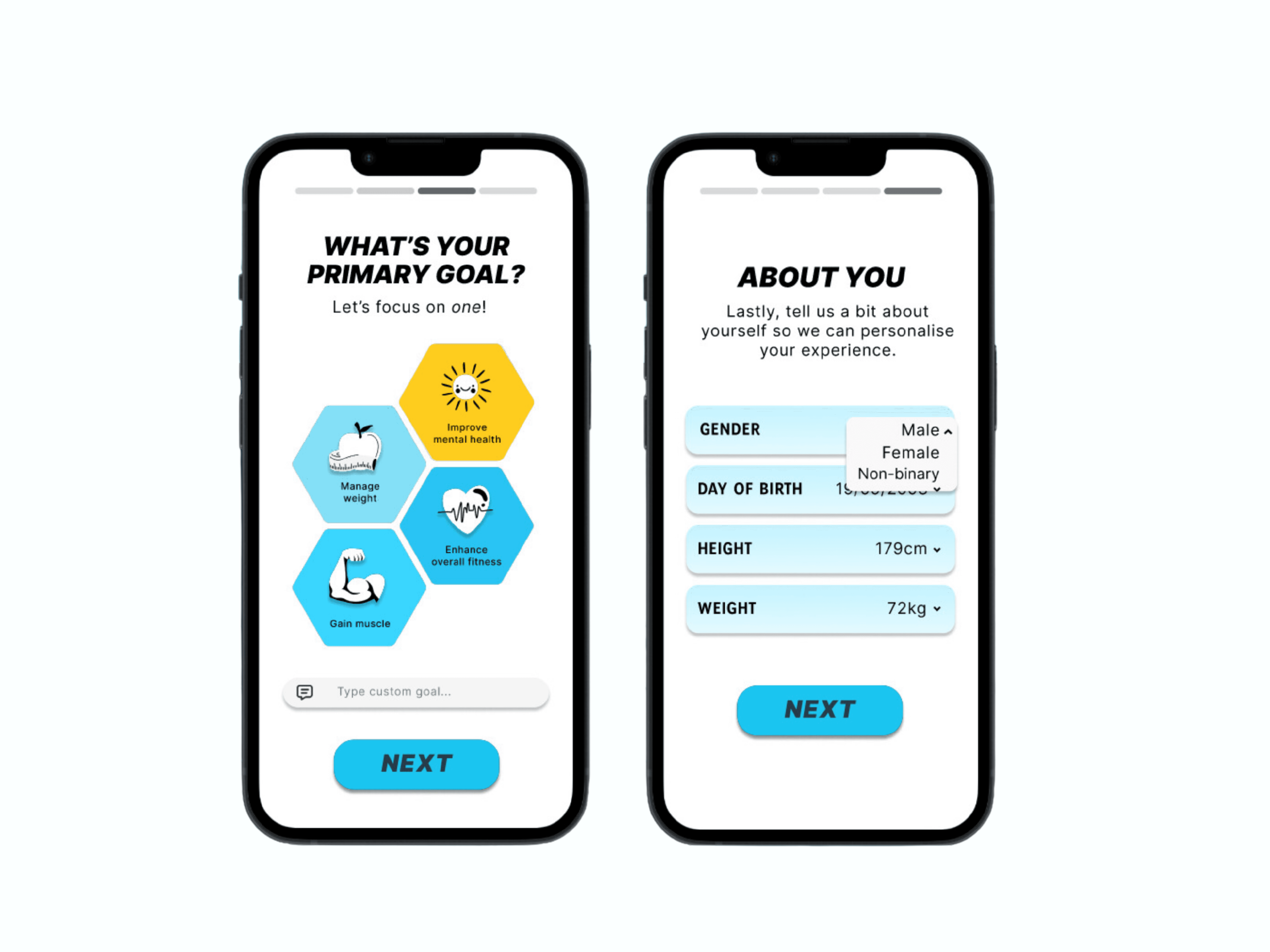
Adjusted the onboarding by allowing users to input a custom goal, recognising that individuals possess differing fitness motivations that can extend much beyond the four presented pre-defined goals
Improved prototype interactivity by implementing more components, such as dropdown menus and tappable buttons that change appearance when selected.
Concluding Thoughts
Research has continually shown that positive reinforcement is most conducive to establishing a sustainable, long-term exercise habit. My primary focus when designing the app was to paint an inclusive, uplifting atmosphere that encourages the user to engage in exercise and feel their best in healthy and attainable ways. This deviates from much of the toxicity and all-or-nothing thinking that permeates throughout fitness culture today.
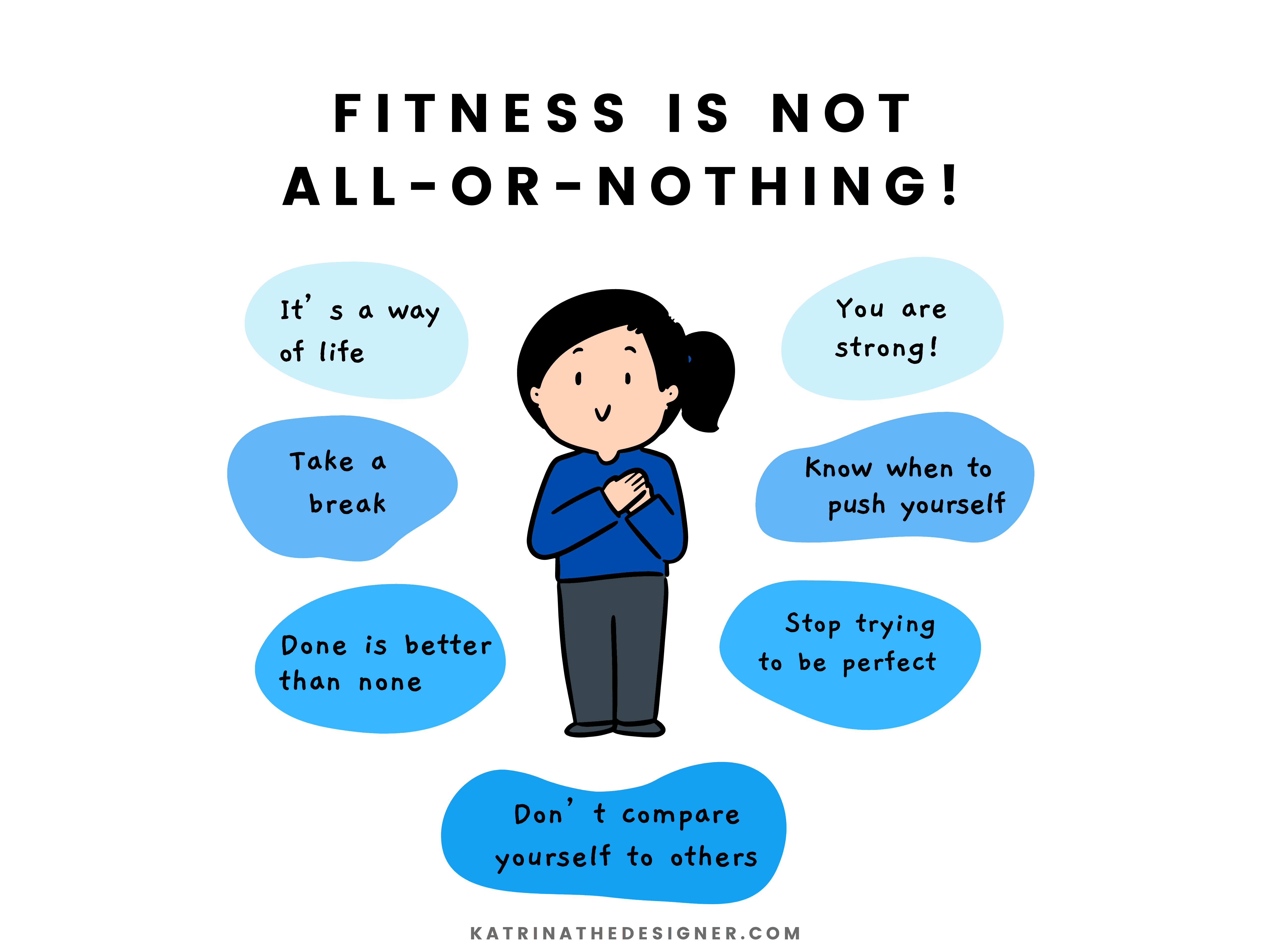
Exercise profoundly impacts obesity and depression, but these complex health conditions cannot be resolved overnight. Thus, it is crucial to design an experience that promotes sustainable habits and a balanced lifestyle, ensuring the app isn't perceived as a 'quick fix' or a '90 day challenge', but rather, a way of life.
While a single workout may not bring immediate changes, consistent effort over time yields progress. Similarly, though depression and obesity are complex issues, it is the small, incremental behaviors like daily movement that help reduce the hold it has over our lives.
In the end, it’s the reps you take that lead you to a Goodlife.
VIEW THE FINAL PROTOTYPE HERE!
year
2024
timeframe
2 months
tools
Figma
category
UI/UX
Growing up, I was never really the biggest fan of sports. My relationship with exercise has since then significantly changed over the years — what initially began as a way to change my appearance quickly became a lifeline, a healthy coping mechanism to navigate life's relentless pressures. The profound impact that exercise has had on my life inspired me to develop an app that brings these benefits to others, especially those who may benefit from it most.
Project Brief
Design a mobile app prototype for Goodlife Health Clubs which provides rural Australians who suffer from depression or obesity advice on exercise and exercise programs to suit their specific needs. The app prototype must adhere to the existing Goodlife Health Clubs branding and design language and must leverage modern UX design principles and trend to suit a modern audience.
7 Step Framework
Employing Artiom Dashinsky's 7 Step Framework from Solving Product Design Exercises, I systematically addressed the design challenge by concentrating on crucial questions and elements. This guided approach encouraged a structured yet innovative ideation process, balancing thoroughness with flexibility.

Three Concept Variations
To address the aforementioned deliverables, I approached the design process by designing three initial concept variations of the same app before user research is conducted. Tackling the issue from numerous angles early on is particularly advantageous because :
a) I generate numerous ideas I would have never thought about otherwise
b) It prevents me from becoming pigeon-holed into developing a prototype for a subpar solution.

Context Variation
The first design concept caters exclusively to rural Australians facing depression, emphasising group-focused exercises. All content, features, and UI components should therefore be thoughtfully crafted to address this audience's specific questions and needs they may have.


This concept aimed to make exercise enjoyable and sustainable, particularly for those with depression, for whom even daily tasks can be challenging. By incorporating features like leaderboards and achievements, I wanted to create a sense of anticipation and motivation, making exercise something to look forward to.


Each time a group member completes a workout, they earn a 'puzzle piece.' As these pieces come together, they create a beautiful, collective image, symbolising the team's journey. This visual celebration fosters camaraderie and serves as a heartfelt tribute to their dedication and hard work.
Aesthetic Variation
I was tasked to design a concept for the app based entirely on Firefox’s ‘Acorn’ design language, which involves bold, vibrant colours and playful illustrations. In this concept, I was given the liberty to break away from Goodlife Health Clubs' current design language and branding, allowing for a more imaginative and innovative approach to the interface design.

Harnessing the joy and energy of childhood play, this concept reimagines exercise for adults as a fun and lighthearted experience. By infusing workouts with a sense of playfulness, the design encourages users to embrace exercise not as a daunting task, but as an enjoyable and rewarding activity.


This concept allowed me to approach the problem from a more playful angle, using vibrant colors and incorporating a workout buddy feature to make exercise fun and engaging. Exercise doesn’t have to be serious and methodical for it to "count". I aimed to make it accessible and welcoming, avoiding the intimidating atmosphere of other fitness apps.
Accessibility Variation
This concept focuses solely on users with low vision, emphasising high-contrast interface design, large fonts, and prominent iconography to enhance accessibility.

I conducted research to enhance app accessibility for the visually impaired, addressing challenges with screen readers and assistive technologies. I sketched screens featuring audio options and robust accessibility settings. Beyond the initial scope, I designed screens to foster inclusivity, including cheering interfaces and graphics featuring diverse representations, such as individuals in wheelchairs.


Emphasising large iconography, text, and unambiguous meaning, this concept sought to simplify exercise for users. Adhering to the Web Accessibility Guidelines, I carefully selected a color scheme with ample contrast, guaranteeing optimal visual clarity and ease of use.
Client Research
I gathered pertinent background information about GoodLife Health Clubs to better understand their branding, message, and goals. By emphasising an authentic connection with clients and celebrating the various reasons people choose fitness, Goodlife aims to create a welcoming environment that promotes overall well-being.

Competitive Audits
Examining direct competitors and similar apps, I analysed successful design elements and common UX principles. By distilling the most effective aspects of these competitors and identifying areas for improvement, I am more able to effectively create a design solution that not only matches but surpasses current industry standards.

Current Trend Research
To stay ahead of the curve, I identified current or emerging UX or interactive App design trends that I could weave into the design.

User Interviews
Interviewing and surveying five users about their exercise habits and fitness app experiences, I identified seven common themes in their responses and organised these insights using affinity mapping techniques.


User Goals
Analysing user interview data, I identified four primary fitness goals shared among the participants.

Personas and Scenarios
I then went on to devise four different personas, with distinct goals and frustrations reflective of the target user as informed by my research. From these personas, I composed three scenarios, visualised by storyboards that helped establish a clear vision and focus for the Goodlife project.


The Final Prototype
Feedback revealed that the aesthetic variation was the most aesthetically pleasing, while the context variation had more innovative features.

Inspired by this, I designed the final prototype, harmonising the aesthetic variation's uplifting visuals with Goodlife's design language and thoughtfully integrating the context variation's engaging elements like leaderboards, community, and celebratory puzzles. This blend nurtures a sense of connection and joy, enhancing the user experience.

Introducing Goodbear, your trusted workout partner to a goodlife!
You can’t spell UX Design without ‘User’!
While it may appear that I’ve finished designing the prototype, all was not complete — it was time to embark on my second round of user interviews.
Following prototype development, I conducted five more user interviews, conducting a qualitative A/B split test for selected screens. It’s important to note that while quantitative tests weren’t feasible given the parameters of the project, implementing them would have greatly improved the user testing process.

User feedback revealed various recurring themes:
Resounding consensus that the app's charming, light-hearted design cultivates an inviting, inclusive atmosphere, motivating users to focus on their health. People love the Goodbear mascot!
Main frustration that users encounter is the footer navigation, which made for an inconsistent navigation experience.
More interactivity in regards to the input components should be established to more closely replicate the final product.
Resulting Changes
Based on the user feedback received, some of the key changes made were:
Changed the scroll behaviour of the footer navigation from "scroll with parent" to "fixed", ensuring it always stayed in view while scrolling
Adjusted the onboarding by allowing users to input a custom goal, recognising that individuals possess differing fitness motivations that can extend much beyond the four presented pre-defined goals
Improved prototype interactivity by implementing more components, such as dropdown menus and tappable buttons that change appearance when selected.
Concluding Thoughts
Research has continually shown that positive reinforcement is most conducive to establishing a sustainable, long-term exercise habit. My primary focus when designing the app was to paint an inclusive, uplifting atmosphere that encourages the user to engage in exercise and feel their best in healthy and attainable ways. This deviates from much of the toxicity and all-or-nothing thinking that permeates throughout fitness culture today.

Exercise profoundly impacts obesity and depression, but these complex health conditions cannot be resolved overnight. Thus, it is crucial to design an experience that promotes sustainable habits and a balanced lifestyle, ensuring the app isn't perceived as a 'quick fix' or a '90 day challenge', but rather, a way of life.
While a single workout may not bring immediate changes, consistent effort over time yields progress. Similarly, though depression and obesity are complex issues, it is the small, incremental behaviors like daily movement that help reduce the hold it has over our lives.
In the end, it’s the reps you take that lead you to a Goodlife.
VIEW THE FINAL PROTOTYPE HERE!
year
2024
timeframe
2 months
tools
Figma
category
UI/UX
Growing up, I was never really the biggest fan of sports. My relationship with exercise has since then significantly changed over the years — what initially began as a way to change my appearance quickly became a lifeline, a healthy coping mechanism to navigate life's relentless pressures. The profound impact that exercise has had on my life inspired me to develop an app that brings these benefits to others, especially those who may benefit from it most.
Project Brief
Design a mobile app prototype for Goodlife Health Clubs which provides rural Australians who suffer from depression or obesity advice on exercise and exercise programs to suit their specific needs. The app prototype must adhere to the existing Goodlife Health Clubs branding and design language and must leverage modern UX design principles and trend to suit a modern audience.
7 Step Framework
Employing Artiom Dashinsky's 7 Step Framework from Solving Product Design Exercises, I systematically addressed the design challenge by concentrating on crucial questions and elements. This guided approach encouraged a structured yet innovative ideation process, balancing thoroughness with flexibility.

Three Concept Variations
To address the aforementioned deliverables, I approached the design process by designing three initial concept variations of the same app before user research is conducted. Tackling the issue from numerous angles early on is particularly advantageous because :
a) I generate numerous ideas I would have never thought about otherwise
b) It prevents me from becoming pigeon-holed into developing a prototype for a subpar solution.

Context Variation
The first design concept caters exclusively to rural Australians facing depression, emphasising group-focused exercises. All content, features, and UI components should therefore be thoughtfully crafted to address this audience's specific questions and needs they may have.


This concept aimed to make exercise enjoyable and sustainable, particularly for those with depression, for whom even daily tasks can be challenging. By incorporating features like leaderboards and achievements, I wanted to create a sense of anticipation and motivation, making exercise something to look forward to.


Each time a group member completes a workout, they earn a 'puzzle piece.' As these pieces come together, they create a beautiful, collective image, symbolising the team's journey. This visual celebration fosters camaraderie and serves as a heartfelt tribute to their dedication and hard work.
Aesthetic Variation
I was tasked to design a concept for the app based entirely on Firefox’s ‘Acorn’ design language, which involves bold, vibrant colours and playful illustrations. In this concept, I was given the liberty to break away from Goodlife Health Clubs' current design language and branding, allowing for a more imaginative and innovative approach to the interface design.

Harnessing the joy and energy of childhood play, this concept reimagines exercise for adults as a fun and lighthearted experience. By infusing workouts with a sense of playfulness, the design encourages users to embrace exercise not as a daunting task, but as an enjoyable and rewarding activity.


This concept allowed me to approach the problem from a more playful angle, using vibrant colors and incorporating a workout buddy feature to make exercise fun and engaging. Exercise doesn’t have to be serious and methodical for it to "count". I aimed to make it accessible and welcoming, avoiding the intimidating atmosphere of other fitness apps.
Accessibility Variation
This concept focuses solely on users with low vision, emphasising high-contrast interface design, large fonts, and prominent iconography to enhance accessibility.

I conducted research to enhance app accessibility for the visually impaired, addressing challenges with screen readers and assistive technologies. I sketched screens featuring audio options and robust accessibility settings. Beyond the initial scope, I designed screens to foster inclusivity, including cheering interfaces and graphics featuring diverse representations, such as individuals in wheelchairs.


Emphasising large iconography, text, and unambiguous meaning, this concept sought to simplify exercise for users. Adhering to the Web Accessibility Guidelines, I carefully selected a color scheme with ample contrast, guaranteeing optimal visual clarity and ease of use.
Client Research
I gathered pertinent background information about GoodLife Health Clubs to better understand their branding, message, and goals. By emphasising an authentic connection with clients and celebrating the various reasons people choose fitness, Goodlife aims to create a welcoming environment that promotes overall well-being.

Competitive Audits
Examining direct competitors and similar apps, I analysed successful design elements and common UX principles. By distilling the most effective aspects of these competitors and identifying areas for improvement, I am more able to effectively create a design solution that not only matches but surpasses current industry standards.

Current Trend Research
To stay ahead of the curve, I identified current or emerging UX or interactive App design trends that I could weave into the design.

User Interviews
Interviewing and surveying five users about their exercise habits and fitness app experiences, I identified seven common themes in their responses and organised these insights using affinity mapping techniques.


User Goals
Analysing user interview data, I identified four primary fitness goals shared among the participants.

Personas and Scenarios
I then went on to devise four different personas, with distinct goals and frustrations reflective of the target user as informed by my research. From these personas, I composed three scenarios, visualised by storyboards that helped establish a clear vision and focus for the Goodlife project.


The Final Prototype
Feedback revealed that the aesthetic variation was the most aesthetically pleasing, while the context variation had more innovative features.

Inspired by this, I designed the final prototype, harmonising the aesthetic variation's uplifting visuals with Goodlife's design language and thoughtfully integrating the context variation's engaging elements like leaderboards, community, and celebratory puzzles. This blend nurtures a sense of connection and joy, enhancing the user experience.

Introducing Goodbear, your trusted workout partner to a goodlife!
You can’t spell UX Design without ‘User’!
While it may appear that I’ve finished designing the prototype, all was not complete — it was time to embark on my second round of user interviews.
Following prototype development, I conducted five more user interviews, conducting a qualitative A/B split test for selected screens. It’s important to note that while quantitative tests weren’t feasible given the parameters of the project, implementing them would have greatly improved the user testing process.

User feedback revealed various recurring themes:
Resounding consensus that the app's charming, light-hearted design cultivates an inviting, inclusive atmosphere, motivating users to focus on their health. People love the Goodbear mascot!
Main frustration that users encounter is the footer navigation, which made for an inconsistent navigation experience.
More interactivity in regards to the input components should be established to more closely replicate the final product.
Resulting Changes
Based on the user feedback received, some of the key changes made were:
Changed the scroll behaviour of the footer navigation from "scroll with parent" to "fixed", ensuring it always stayed in view while scrolling
Adjusted the onboarding by allowing users to input a custom goal, recognising that individuals possess differing fitness motivations that can extend much beyond the four presented pre-defined goals
Improved prototype interactivity by implementing more components, such as dropdown menus and tappable buttons that change appearance when selected.
Concluding Thoughts
Research has continually shown that positive reinforcement is most conducive to establishing a sustainable, long-term exercise habit. My primary focus when designing the app was to paint an inclusive, uplifting atmosphere that encourages the user to engage in exercise and feel their best in healthy and attainable ways. This deviates from much of the toxicity and all-or-nothing thinking that permeates throughout fitness culture today.

Exercise profoundly impacts obesity and depression, but these complex health conditions cannot be resolved overnight. Thus, it is crucial to design an experience that promotes sustainable habits and a balanced lifestyle, ensuring the app isn't perceived as a 'quick fix' or a '90 day challenge', but rather, a way of life.
While a single workout may not bring immediate changes, consistent effort over time yields progress. Similarly, though depression and obesity are complex issues, it is the small, incremental behaviors like daily movement that help reduce the hold it has over our lives.
In the end, it’s the reps you take that lead you to a Goodlife.
VIEW THE FINAL PROTOTYPE HERE!
year
2024
timeframe
2 months
tools
Figma
category
UI/UX
Growing up, I was never really the biggest fan of sports. My relationship with exercise has since then significantly changed over the years — what initially began as a way to change my appearance quickly became a lifeline, a healthy coping mechanism to navigate life's relentless pressures. The profound impact that exercise has had on my life inspired me to develop an app that brings these benefits to others, especially those who may benefit from it most.
Project Brief
Design a mobile app prototype for Goodlife Health Clubs which provides rural Australians who suffer from depression or obesity advice on exercise and exercise programs to suit their specific needs. The app prototype must adhere to the existing Goodlife Health Clubs branding and design language and must leverage modern UX design principles and trend to suit a modern audience.
7 Step Framework
Employing Artiom Dashinsky's 7 Step Framework from Solving Product Design Exercises, I systematically addressed the design challenge by concentrating on crucial questions and elements. This guided approach encouraged a structured yet innovative ideation process, balancing thoroughness with flexibility.

Three Concept Variations
To address the aforementioned deliverables, I approached the design process by designing three initial concept variations of the same app before user research is conducted. Tackling the issue from numerous angles early on is particularly advantageous because :
a) I generate numerous ideas I would have never thought about otherwise
b) It prevents me from becoming pigeon-holed into developing a prototype for a subpar solution.

Context Variation
The first design concept caters exclusively to rural Australians facing depression, emphasising group-focused exercises. All content, features, and UI components should therefore be thoughtfully crafted to address this audience's specific questions and needs they may have.


This concept aimed to make exercise enjoyable and sustainable, particularly for those with depression, for whom even daily tasks can be challenging. By incorporating features like leaderboards and achievements, I wanted to create a sense of anticipation and motivation, making exercise something to look forward to.


Each time a group member completes a workout, they earn a 'puzzle piece.' As these pieces come together, they create a beautiful, collective image, symbolising the team's journey. This visual celebration fosters camaraderie and serves as a heartfelt tribute to their dedication and hard work.
Aesthetic Variation
I was tasked to design a concept for the app based entirely on Firefox’s ‘Acorn’ design language, which involves bold, vibrant colours and playful illustrations. In this concept, I was given the liberty to break away from Goodlife Health Clubs' current design language and branding, allowing for a more imaginative and innovative approach to the interface design.

Harnessing the joy and energy of childhood play, this concept reimagines exercise for adults as a fun and lighthearted experience. By infusing workouts with a sense of playfulness, the design encourages users to embrace exercise not as a daunting task, but as an enjoyable and rewarding activity.


This concept allowed me to approach the problem from a more playful angle, using vibrant colors and incorporating a workout buddy feature to make exercise fun and engaging. Exercise doesn’t have to be serious and methodical for it to "count". I aimed to make it accessible and welcoming, avoiding the intimidating atmosphere of other fitness apps.
Accessibility Variation
This concept focuses solely on users with low vision, emphasising high-contrast interface design, large fonts, and prominent iconography to enhance accessibility.

I conducted research to enhance app accessibility for the visually impaired, addressing challenges with screen readers and assistive technologies. I sketched screens featuring audio options and robust accessibility settings. Beyond the initial scope, I designed screens to foster inclusivity, including cheering interfaces and graphics featuring diverse representations, such as individuals in wheelchairs.


Emphasising large iconography, text, and unambiguous meaning, this concept sought to simplify exercise for users. Adhering to the Web Accessibility Guidelines, I carefully selected a color scheme with ample contrast, guaranteeing optimal visual clarity and ease of use.
Client Research
I gathered pertinent background information about GoodLife Health Clubs to better understand their branding, message, and goals. By emphasising an authentic connection with clients and celebrating the various reasons people choose fitness, Goodlife aims to create a welcoming environment that promotes overall well-being.

Competitive Audits
Examining direct competitors and similar apps, I analysed successful design elements and common UX principles. By distilling the most effective aspects of these competitors and identifying areas for improvement, I am more able to effectively create a design solution that not only matches but surpasses current industry standards.

Current Trend Research
To stay ahead of the curve, I identified current or emerging UX or interactive App design trends that I could weave into the design.

User Interviews
Interviewing and surveying five users about their exercise habits and fitness app experiences, I identified seven common themes in their responses and organised these insights using affinity mapping techniques.


User Goals
Analysing user interview data, I identified four primary fitness goals shared among the participants.

Personas and Scenarios
I then went on to devise four different personas, with distinct goals and frustrations reflective of the target user as informed by my research. From these personas, I composed three scenarios, visualised by storyboards that helped establish a clear vision and focus for the Goodlife project.


The Final Prototype
Feedback revealed that the aesthetic variation was the most aesthetically pleasing, while the context variation had more innovative features.

Inspired by this, I designed the final prototype, harmonising the aesthetic variation's uplifting visuals with Goodlife's design language and thoughtfully integrating the context variation's engaging elements like leaderboards, community, and celebratory puzzles. This blend nurtures a sense of connection and joy, enhancing the user experience.

Introducing Goodbear, your trusted workout partner to a goodlife!
You can’t spell UX Design without ‘User’!
While it may appear that I’ve finished designing the prototype, all was not complete — it was time to embark on my second round of user interviews.
Following prototype development, I conducted five more user interviews, conducting a qualitative A/B split test for selected screens. It’s important to note that while quantitative tests weren’t feasible given the parameters of the project, implementing them would have greatly improved the user testing process.

User feedback revealed various recurring themes:
Resounding consensus that the app's charming, light-hearted design cultivates an inviting, inclusive atmosphere, motivating users to focus on their health. People love the Goodbear mascot!
Main frustration that users encounter is the footer navigation, which made for an inconsistent navigation experience.
More interactivity in regards to the input components should be established to more closely replicate the final product.
Resulting Changes
Based on the user feedback received, some of the key changes made were:
Changed the scroll behaviour of the footer navigation from "scroll with parent" to "fixed", ensuring it always stayed in view while scrolling
Adjusted the onboarding by allowing users to input a custom goal, recognising that individuals possess differing fitness motivations that can extend much beyond the four presented pre-defined goals
Improved prototype interactivity by implementing more components, such as dropdown menus and tappable buttons that change appearance when selected.
Concluding Thoughts
Research has continually shown that positive reinforcement is most conducive to establishing a sustainable, long-term exercise habit. My primary focus when designing the app was to paint an inclusive, uplifting atmosphere that encourages the user to engage in exercise and feel their best in healthy and attainable ways. This deviates from much of the toxicity and all-or-nothing thinking that permeates throughout fitness culture today.

Exercise profoundly impacts obesity and depression, but these complex health conditions cannot be resolved overnight. Thus, it is crucial to design an experience that promotes sustainable habits and a balanced lifestyle, ensuring the app isn't perceived as a 'quick fix' or a '90 day challenge', but rather, a way of life.
While a single workout may not bring immediate changes, consistent effort over time yields progress. Similarly, though depression and obesity are complex issues, it is the small, incremental behaviors like daily movement that help reduce the hold it has over our lives.
In the end, it’s the reps you take that lead you to a Goodlife.
VIEW THE FINAL PROTOTYPE HERE!
year
2024
timeframe
2 months
tools
Figma
category
UI/UX
01
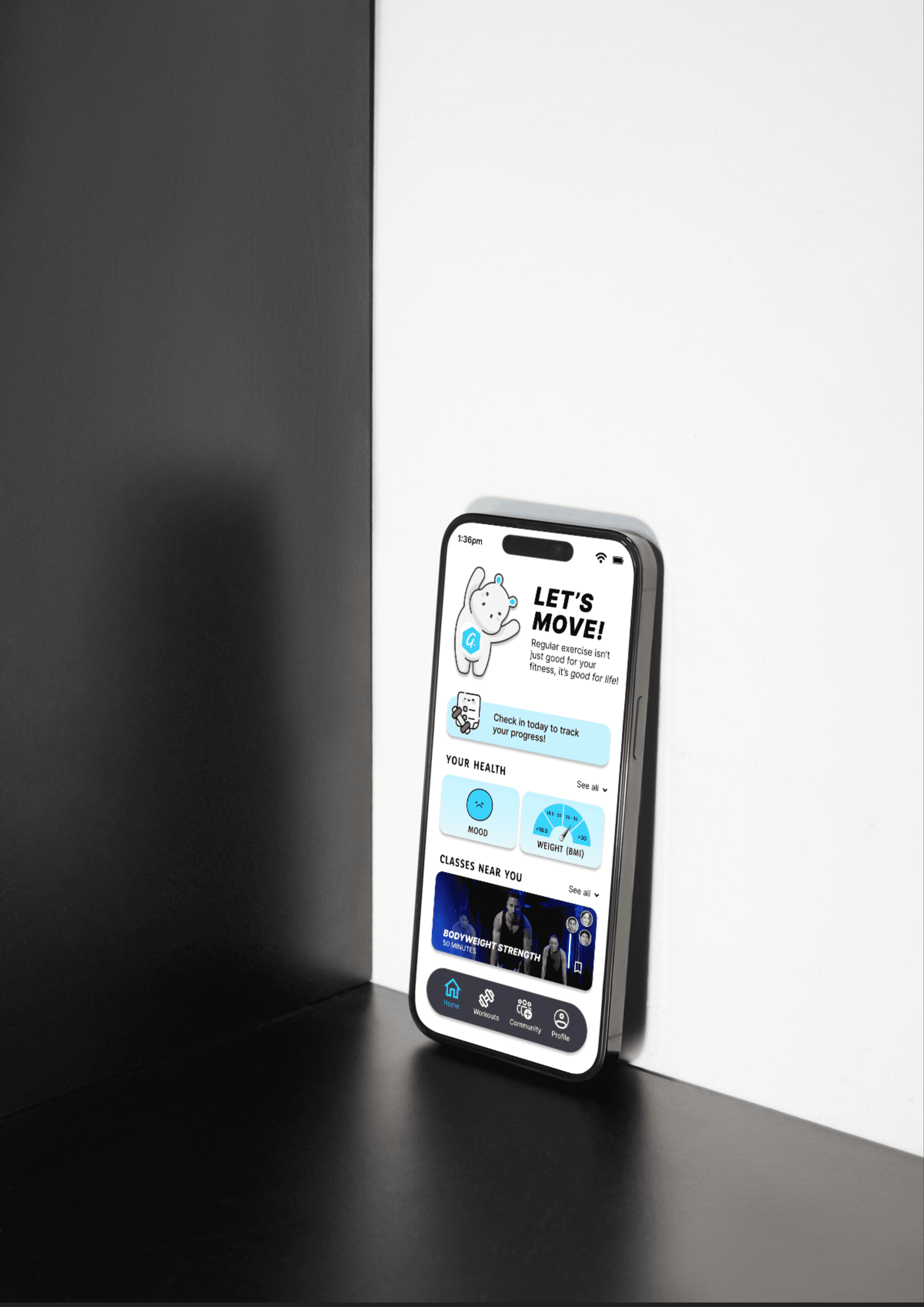
The home screen dashboard offers a convenient way to monitor your progress with a check-in feature, providing easy access to your mood and weight statistics through a quick button.
01

The home screen dashboard offers a convenient way to monitor your progress with a check-in feature, providing easy access to your mood and weight statistics through a quick button.
01

The home screen dashboard offers a convenient way to monitor your progress with a check-in feature, providing easy access to your mood and weight statistics through a quick button.
01

The home screen dashboard offers a convenient way to monitor your progress with a check-in feature, providing easy access to your mood and weight statistics through a quick button.
02
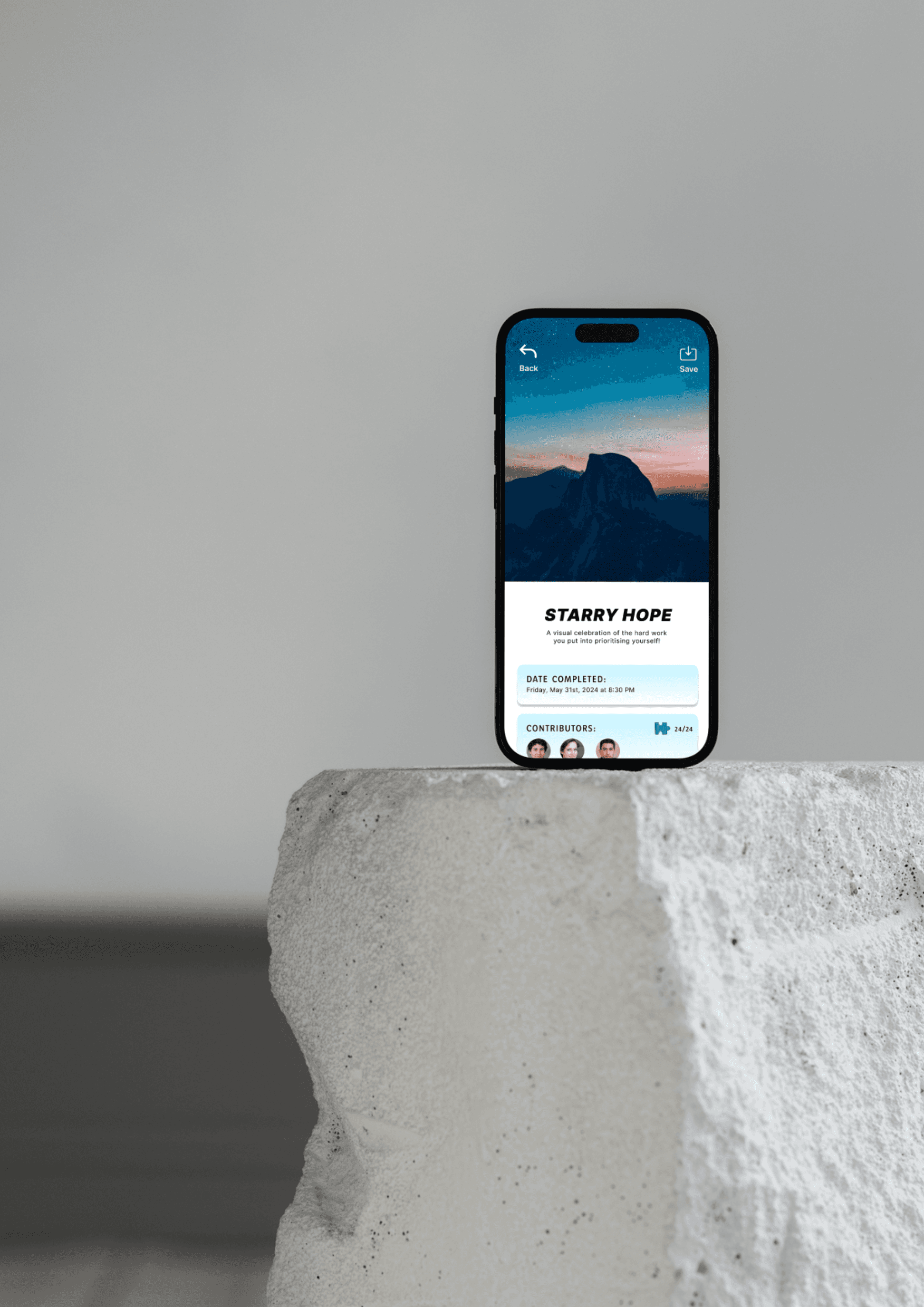
The app's puzzle gallery incentivises exercise, as users contribute to and complete puzzles through their workouts, nurturing a sense of community and accomplishment.
02

The app's puzzle gallery incentivises exercise, as users contribute to and complete puzzles through their workouts, nurturing a sense of community and accomplishment.
02

The app's puzzle gallery incentivises exercise, as users contribute to and complete puzzles through their workouts, nurturing a sense of community and accomplishment.
02

The app's puzzle gallery incentivises exercise, as users contribute to and complete puzzles through their workouts, nurturing a sense of community and accomplishment.
03
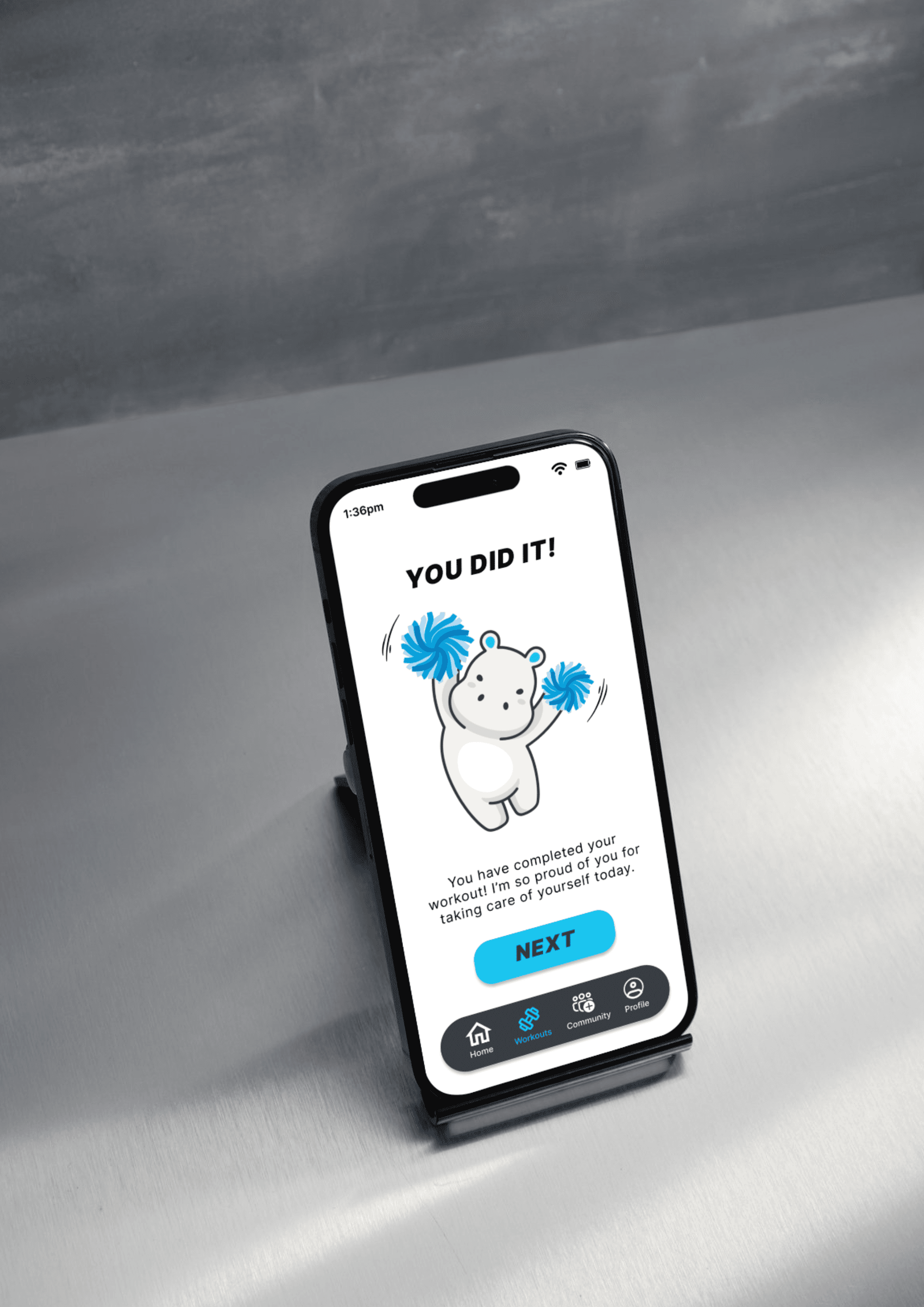
The app utilises positive reinforcement, a scientifically proven method for habit formation, by featuring endearing mascot, Goodbear, to celebrate accomplishments upon completion.
03

The app utilises positive reinforcement, a scientifically proven method for habit formation, by featuring endearing mascot, Goodbear, to celebrate accomplishments upon completion.
03

The app utilises positive reinforcement, a scientifically proven method for habit formation, by featuring endearing mascot, Goodbear, to celebrate accomplishments upon completion.
03

The app utilises positive reinforcement, a scientifically proven method for habit formation, by featuring endearing mascot, Goodbear, to celebrate accomplishments upon completion.
